-

Does our technology still work for us?
I've seen a lot of talk recently about all the work that we need to do to help usher in the new age of "AI Agents." That really begs the question, does our technology still work for us or are we working for it?
-

Product pricing, dev bad habits, and the role of the pit of success
Pricing disincentivizes best practices. It shouldn’t. Let's look at how improper pricing affects how developers use your product.
-

Astro Server Island for latest Bluesky post (heavily cached!)
Hopefully later, I'll come back and do a full write up, but in the meantime, here's a video of creating an Astro Server Island to show your latest Bluesky post. This is what powers my "latest from bluesky" widget on the homepage of this site.
-

Type-safe environment variables in Astro 5.0
Astro’s 5.0 beta has released a stable version of its astro:env module. This allows for developers to configure a schema for their environment variables and then take advantage of new feature this opens.
-
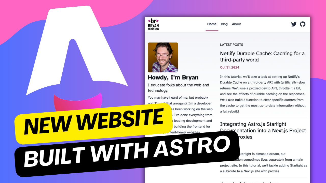
New Website, but really is it?
Launched a new version of the website... it's still pretty much the same, but way less complicated
-

Netlify Durable Cache: Caching for a third-party world
In this tutorial, we’ll take a look at setting up Netlify’s Durable Cache on a third-party API with (artificially) slow returns. We’ll use a proxied dev.to API, throttle it a bit, and see the effects of durable caching on the responses. We’ll also build a function to clear specific authors from the cache to get the most up-to-date information without a full rebuild.
-

Introducing the Hygraph Astro Content Loader
Hygraph and Astro were already a match made in heaven. Now with the Hygraph Content Loader, setting things up has never been easier.
-
Integrating Astro.js Starlight Documentation into a Next.js Project Using Proxies
Using Astro Starlight is almost a dream, but documentation sometimes lives separately from a main project site. In this tutorial, we'll tackle adding Starlight as a subroute to a Next.js site with proxies
-
Jamstack is meaningless
Right at the top, let’s say what’s in the title… The name Jamstack is meaningless… but then again, so is MACH … and composable… and headless… and Developer experience… and serverless…, but also, they’re all hugely important Meaningless and hugely important seem to be almost diametrically opposed, so let me take a step back and explain
-
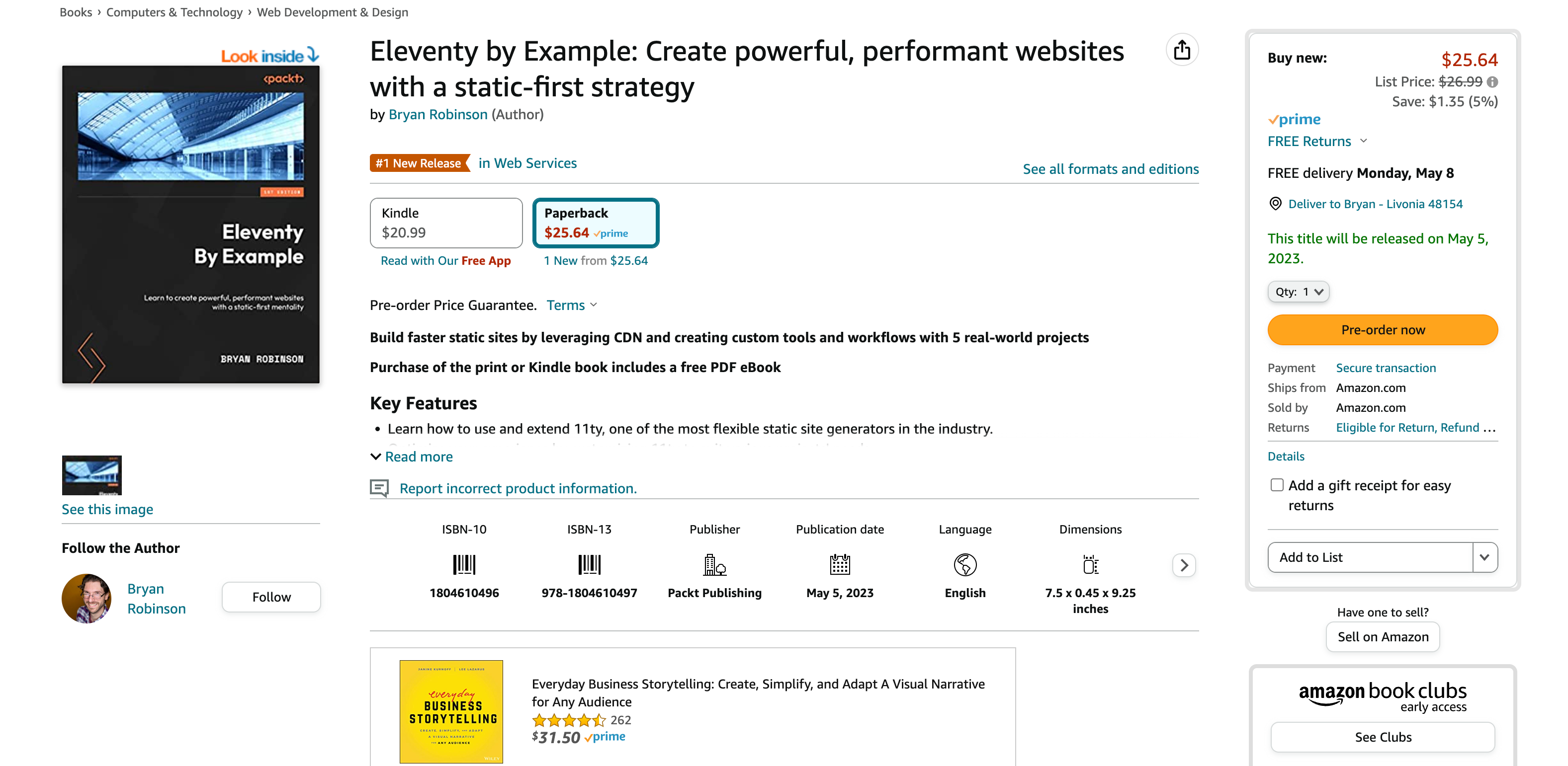
😱 Book Release: Eleventy by Example – Learn 11ty with 5 in-depth projects
Oh! Hey! I wrote a book. Fancy that! It's, of course, all about 11ty.
-
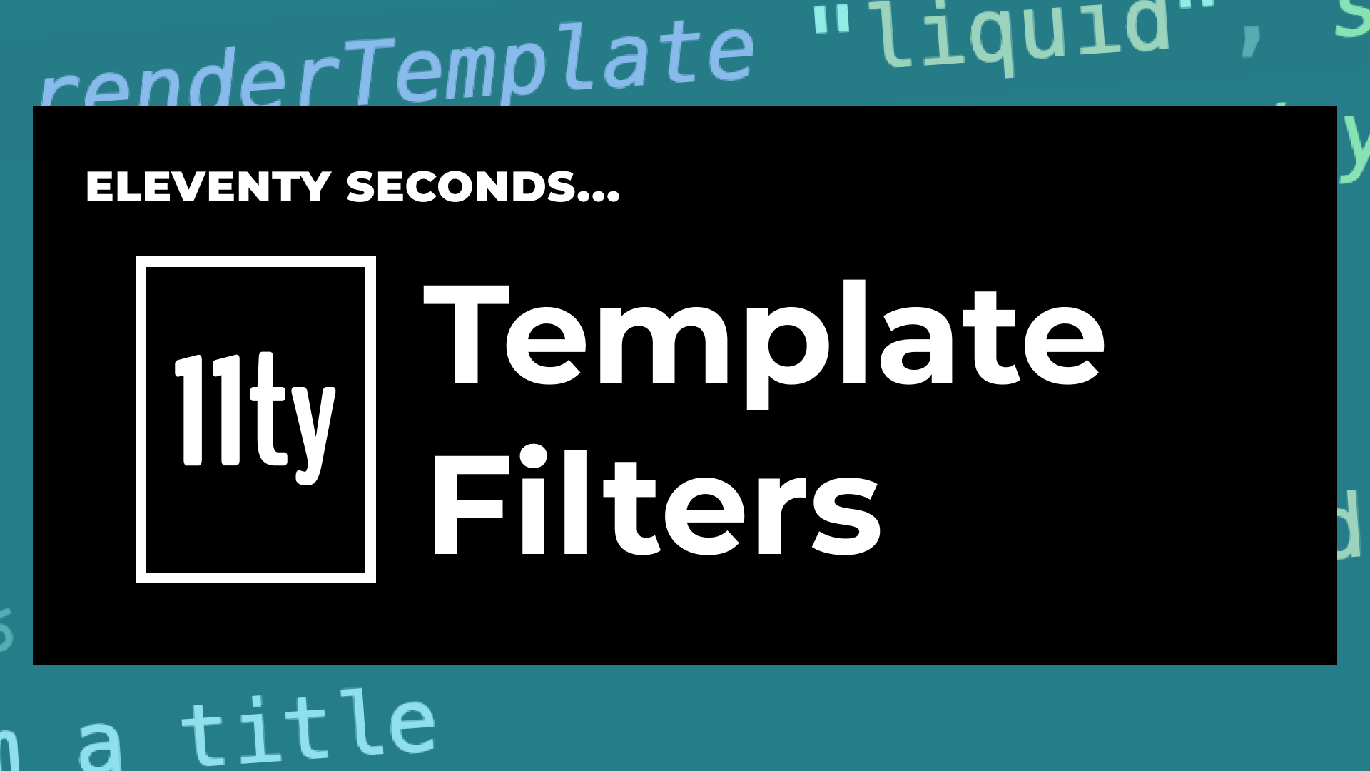
11ty Second 11ty: Creating Template Filters
This week, we’re going to dive into 11ty filters. We’ll use 1 built-in filter, and make 2 custom filters.
-
11ty Second 11ty: Global Data files (JS and JSON)
In these two videos, we take 110 seconds each to discuss how to use 11ty's Global Data files to pull static data with JSON and dynamic (at build time) data with JavaScript.
-

11ty second 11ty: The Render Plugin Part 1
The Render plugin is comprised of two shortcodes for use in your Nunjucks, Liquid or JS templates. It’s a plugin that is bundled with the main 11ty NPM package and ready to use as soon as you nom install 11ty.
-
Help needed: Netlify's Dusty Domains event – Give me your domain ideas
Netlify has this great event for December: dusty.domains, but I don’t have any old domains. I still want to participate, and that's where you come in! I need domain ideas. For every domain idea I get (that's an available domain), I'll donate $1 to one of the four charities on the Dusty Domains site (up to $100).
-
Frontend environment variables with Astro.js
How to set up environment variables for use in client-side "islands" in AstroJS
-

Quick experiment with the Slinkity 11ty plugin
A quick write up of my first experiment with the Slinkity 11ty plugin. We build a quick "Like" button for my son's art site.
-
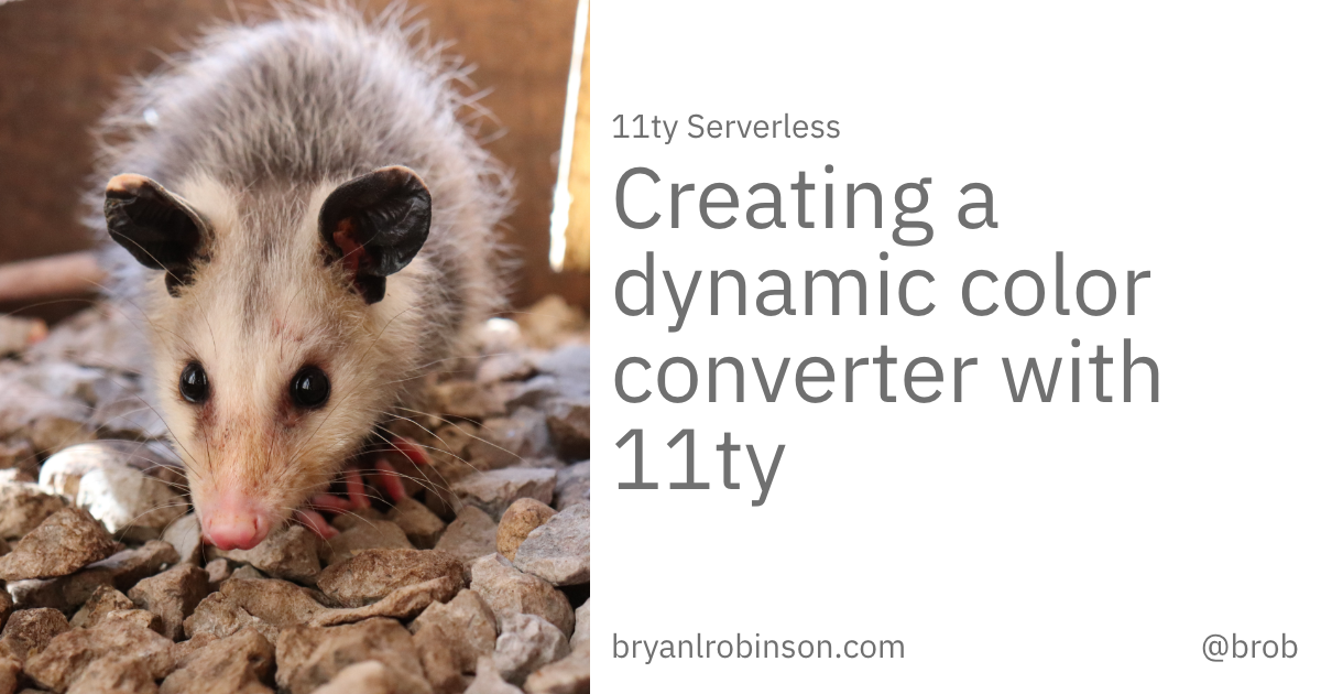
Creating a dynamic color converter with 11ty Serverless
11ty started out as a static site generator, but is quickly getting into the dynamic game. Use the templates and structure you love, but use them on the server, as well!
-
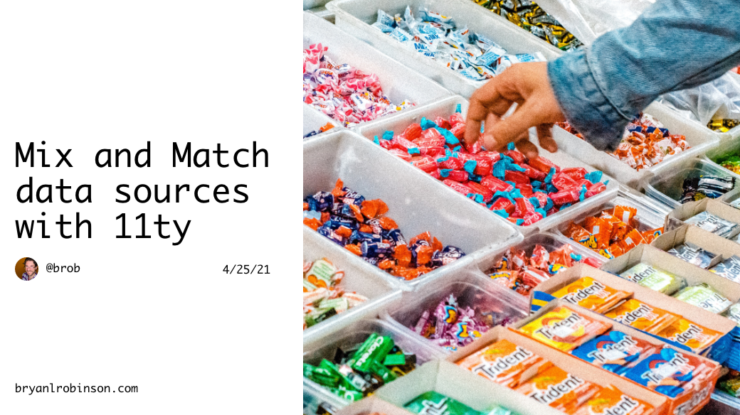
Using 11ty JavaScript Data files to mix Markdown and CMS content into one collection
In this article, we'll mix Markdown files with external data sources to create a unified 11ty Collection.
-
How to show your template code in 11ty blog posts
-

New City, New Job, New Content
-
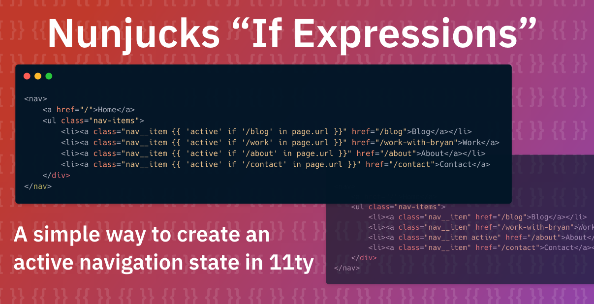
Using Nunjucks 'If Expressions' in 11ty to create a simple active navigation state
-

Climbing the 11ty Performance leaderboard with Cloudinary, critical CSS and more
-
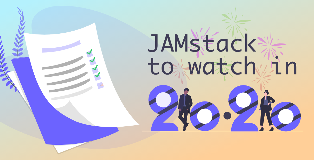
Three JAMstack movements to watch in 2020
-
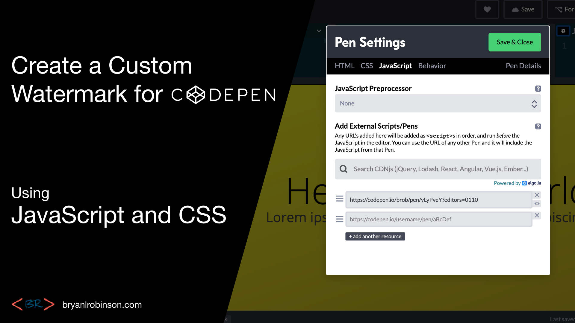
Create a Codepen promo watermark with no additional HTML, CSS or JS
-
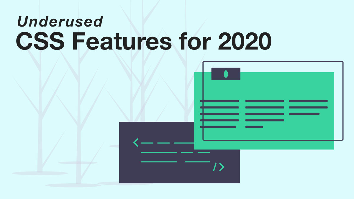
3 underused CSS features to learn for 2020
-
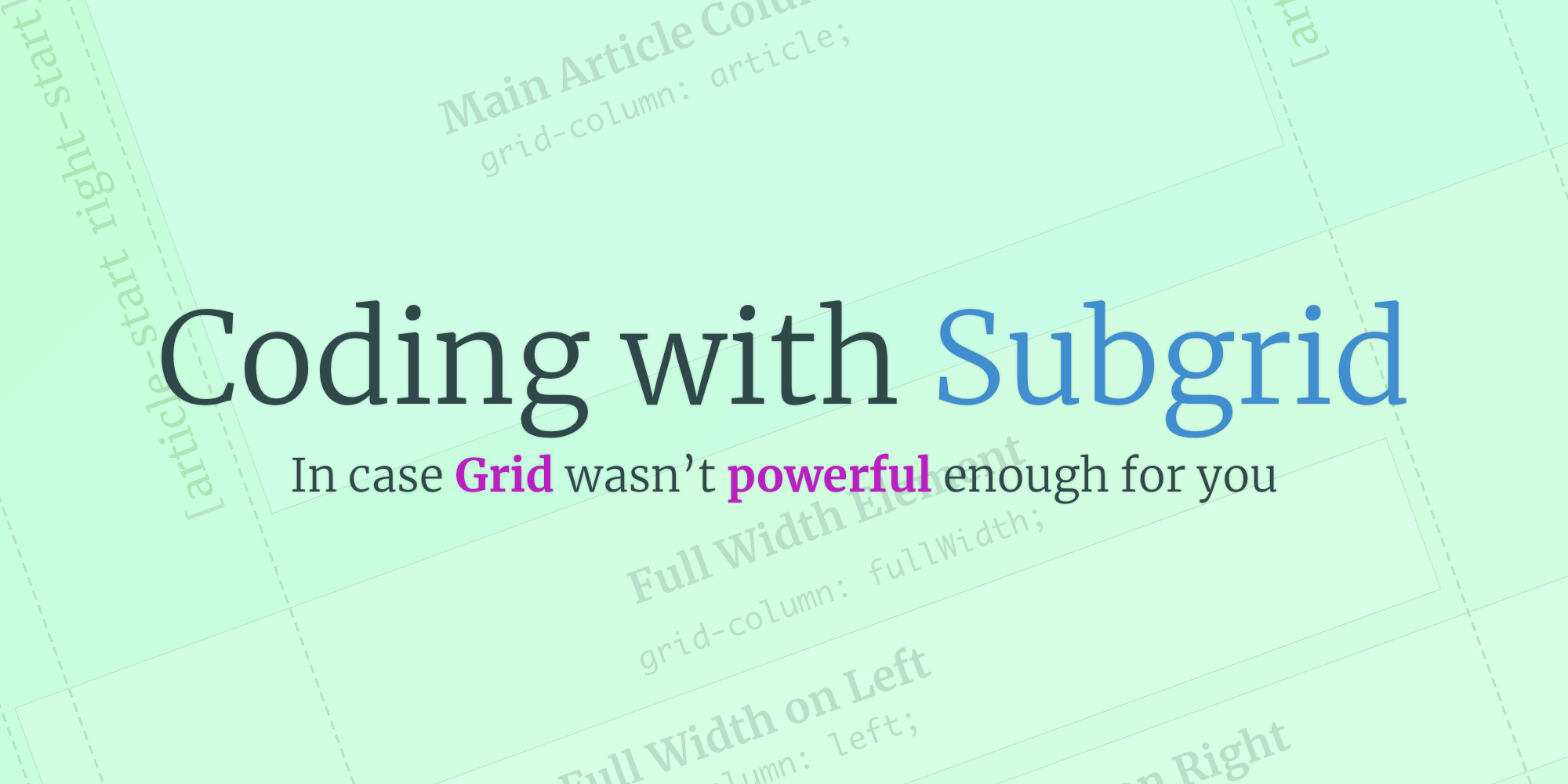
Use CSS Subgrid to layout full-width content stripes in an article template
-

Adapt client-side JavaScript for use in 11ty (Eleventy) data files
-
CSS Gap creates a bright future for margins in Flex as well as Grid
-
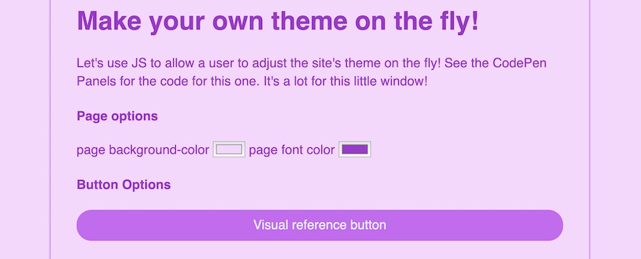
Create your first CSS Custom Properties (Variables)
-
Use CSS Grid to create a self-centering full-width element
-

Creating an 11ty Plugin - SVG Embed Tool
-

Now offering design and code reviews at PeerReviews.dev
-

Routing contact-form emails to different addresses with Netlify, Zapier and SendGrid
-
Create an Eleventy (11ty) theme based on a free HTML template
-
Client work and the JAMstack
-
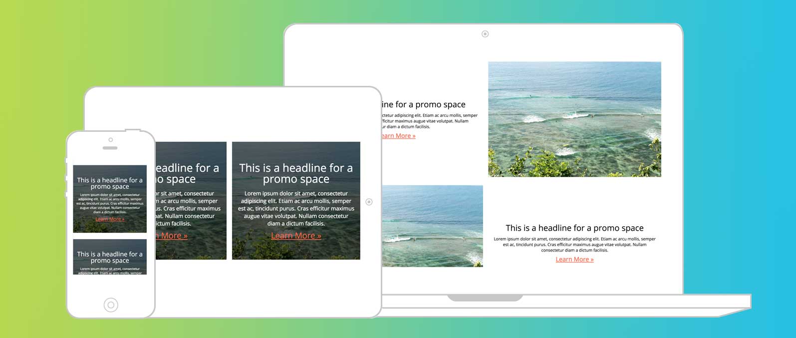
Grid vs. Flex: A Tale of a "Simple" Promo Space
-
Using Eleventy's (11ty) JavaScript Data Files
-
The Tech Barrier to Entry
-
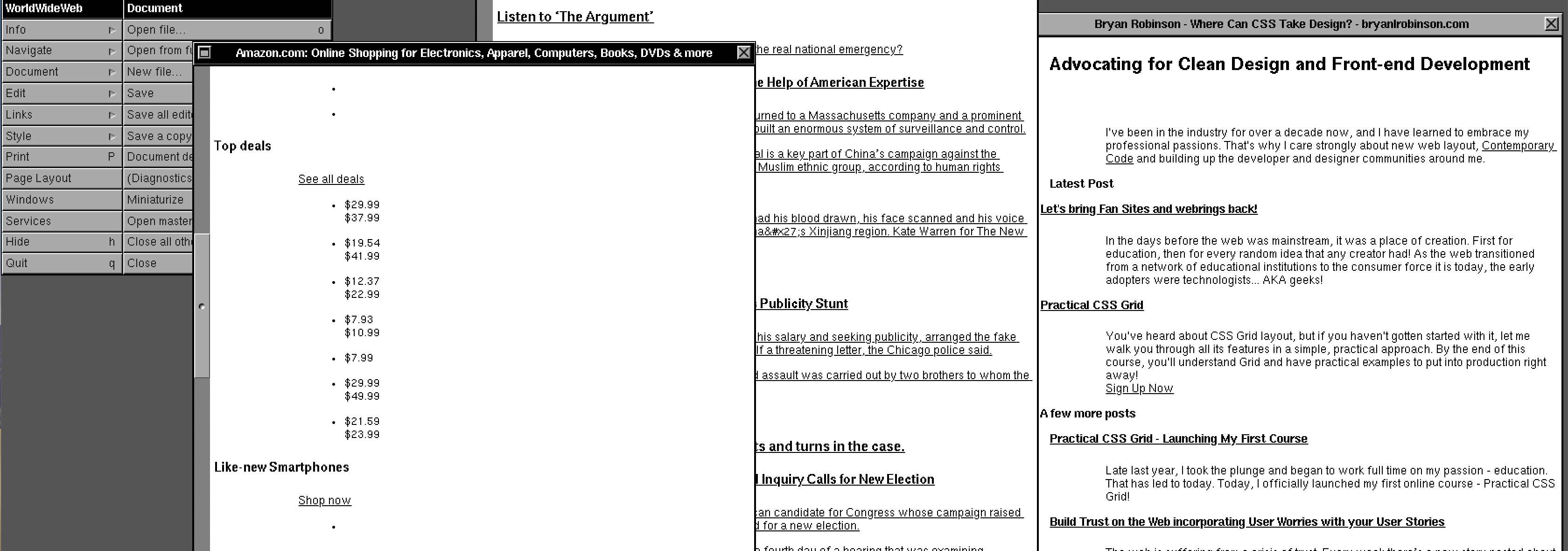
What Can We Learn from CERN's WorldWideWeb rebuild?
-
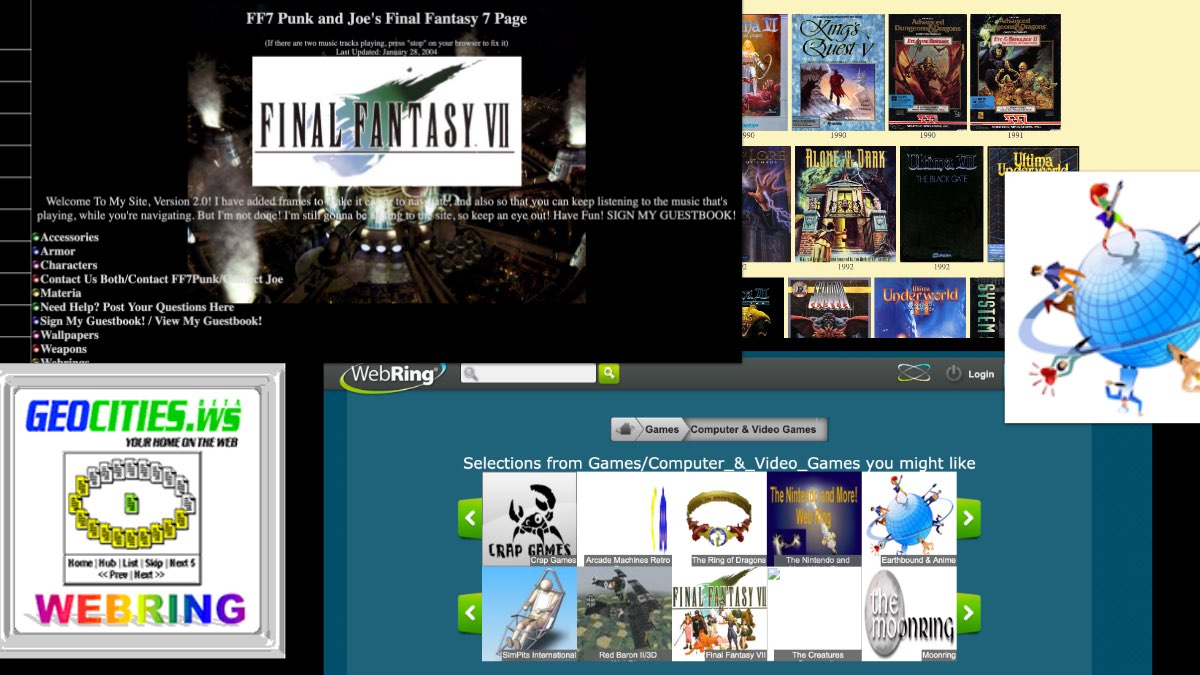
Let's bring Fan Sites and webrings back!
-
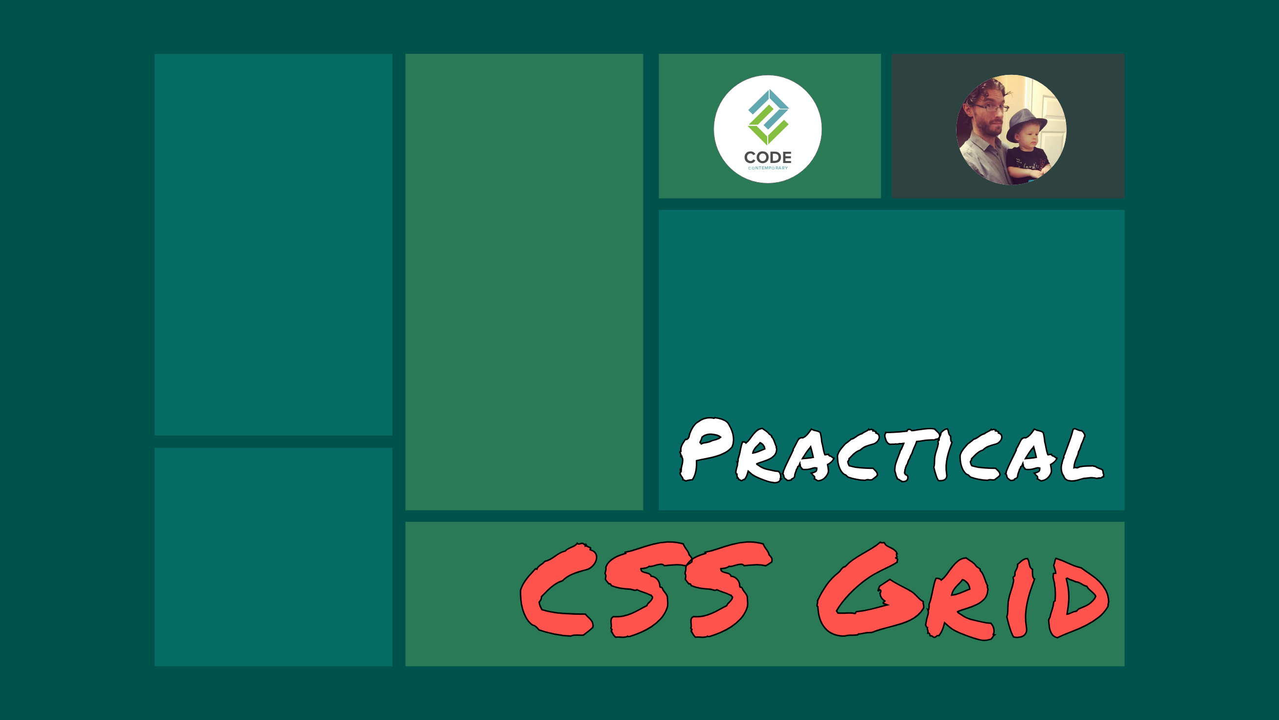
Practical CSS Grid - Launching My First Course
-

Build Trust on the Web incorporating User Worries with your User Stories
-

2019 The Year of Markup-First Development
-
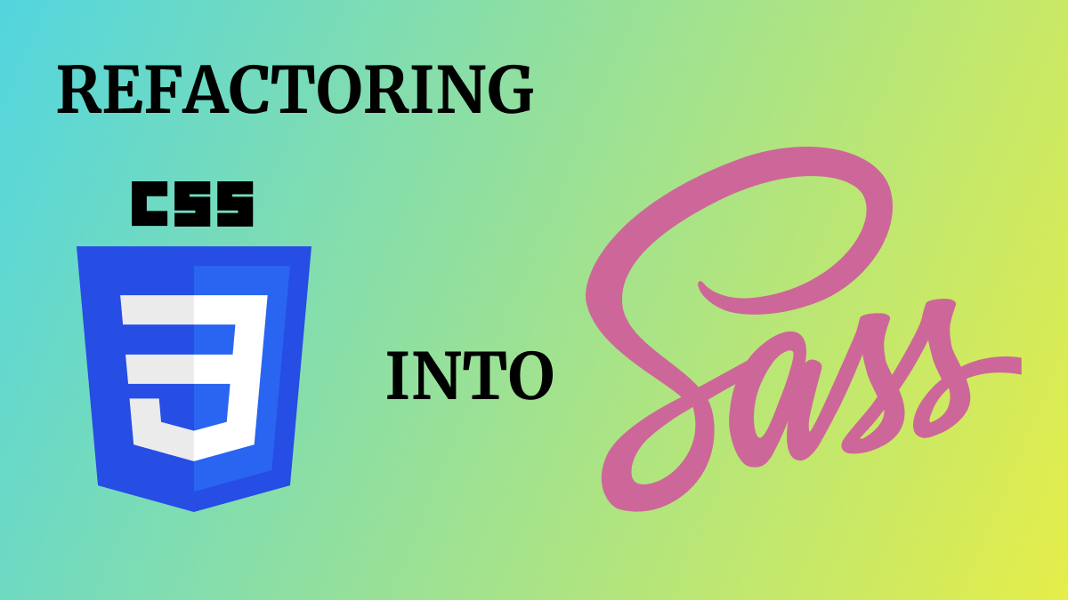
Refactoring CSS into a Sass mixin
-

Starting a new journey with Code Contemporary
-
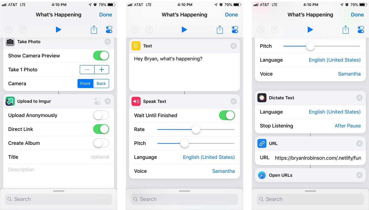
Dynamic Static Sites with Netlify and iOS Shortcuts
-
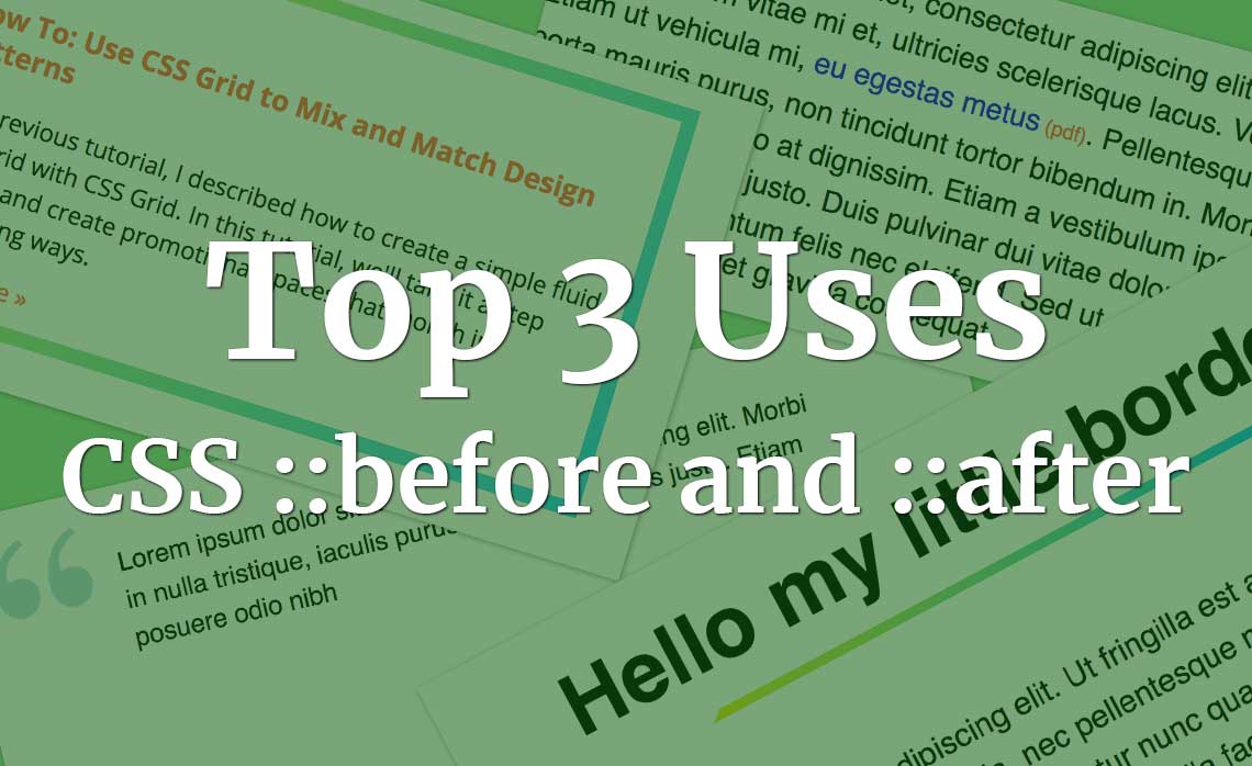
Top 3 uses for the ::before and ::after CSS pseudo elements
-
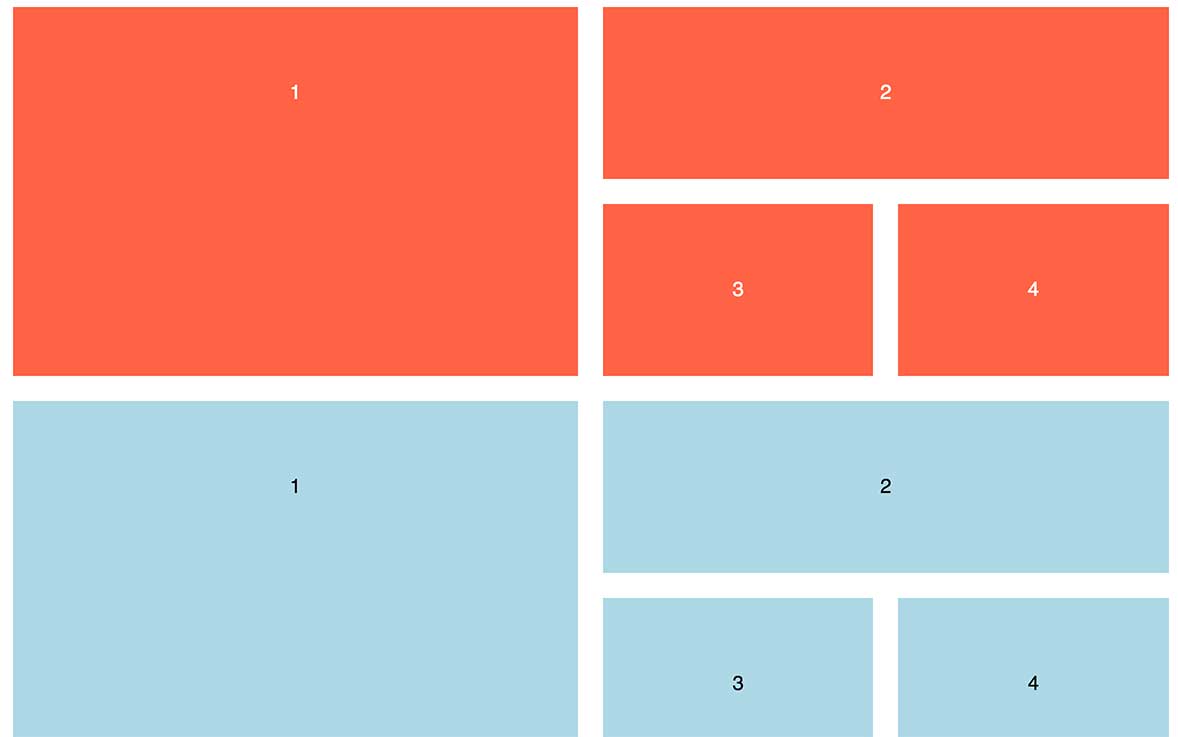
How To: Use CSS Grid to Mix and Match Design Patterns
-

Use CSS ::before and ::after for simple, spicy image overlays
-
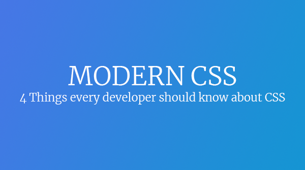
Modern CSS: Four Things Every Developer and Designer Should Know About CSS
-
3 Strategies for Getting Started with CSS Grid
-
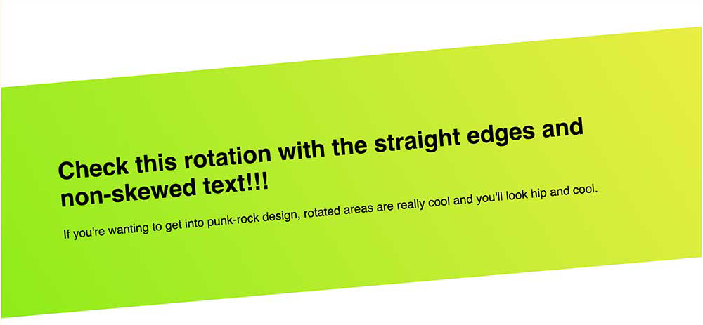
CSS Tip: Use rotate() and skew() together to introduce some clean punk rock to your CSS
-
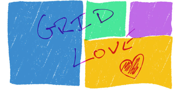
The 5 Stages of Grid Love
-
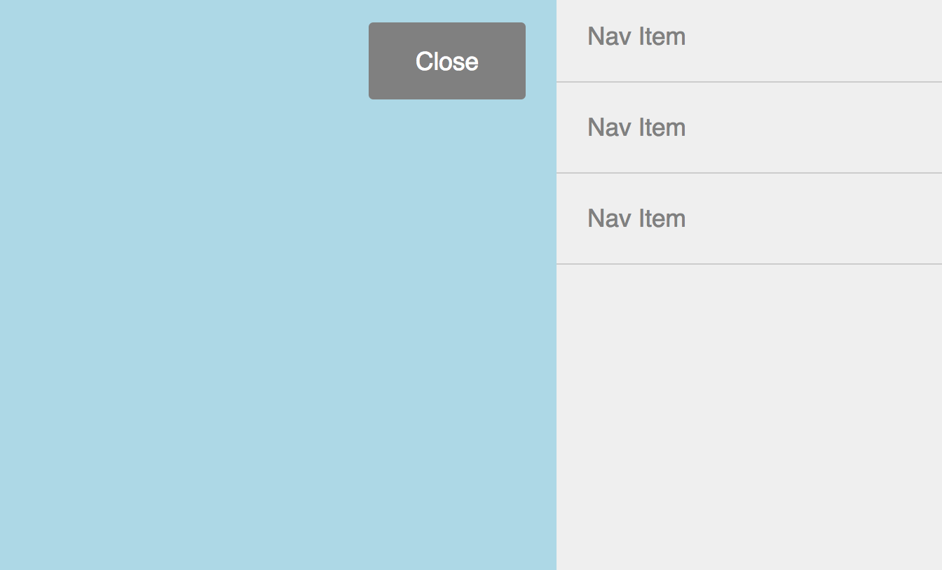
How To: A CSS-Only Mobile Off Canvas Navigation
-
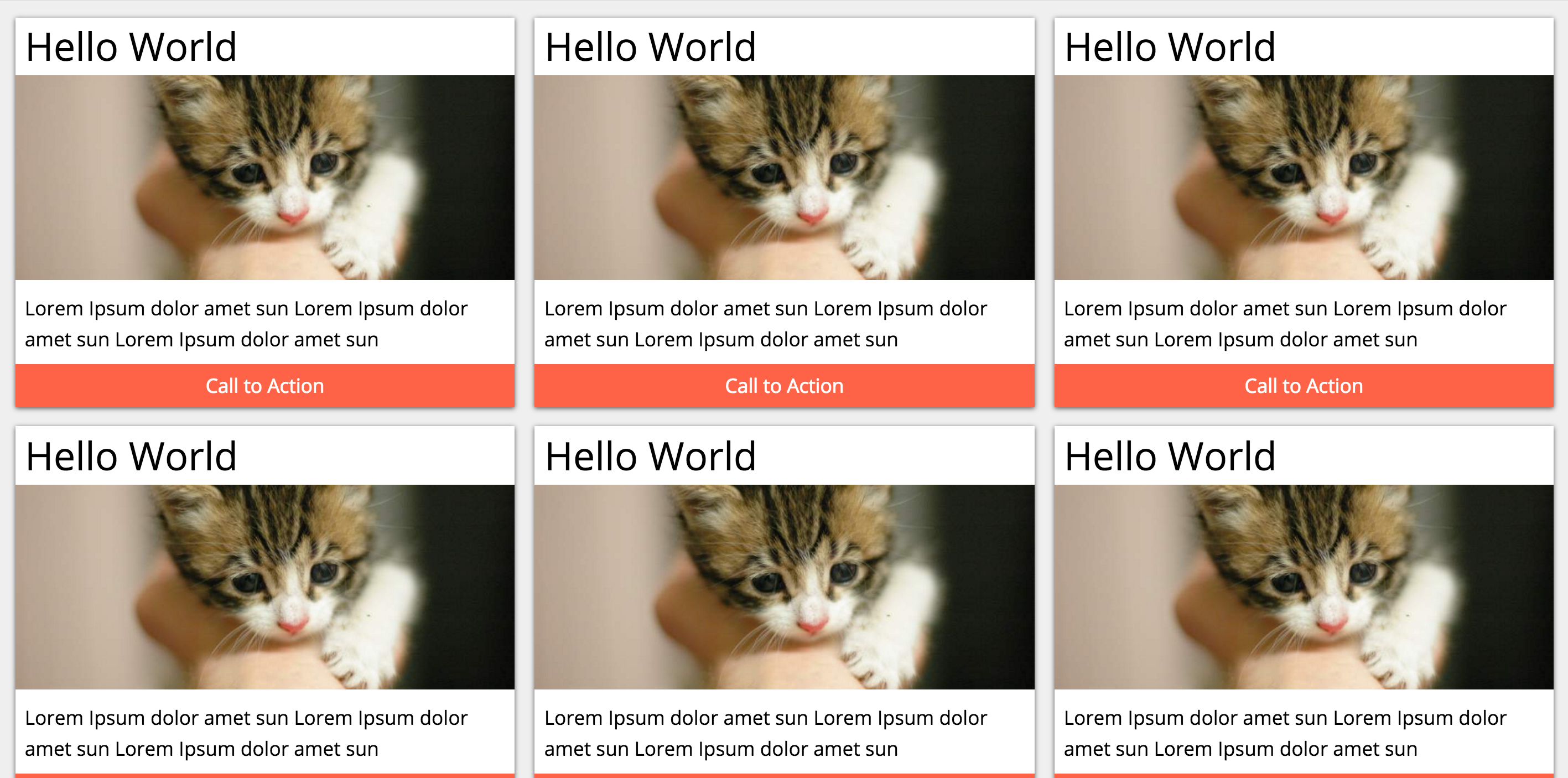
How To: Use CSS Grid Layout to Make a Simple, Fluid Card Grid
-

Make a More Flexible Cover Screen with CSS Grid
-
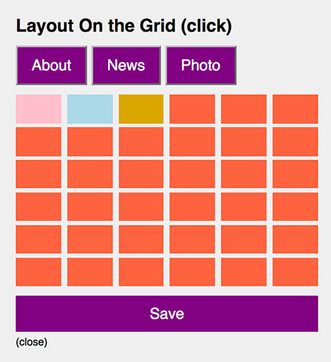
Can CSS Grid open up interesting CMS Layout options?
-

Firefox 52 to Introduce New Box-Alignment Values
-
Falling Forward — Rethinking Progressive Enhancement, Graceful Degradation and Developer Morality
-
Start Exploring the Magic of CSS Grid Layout
-
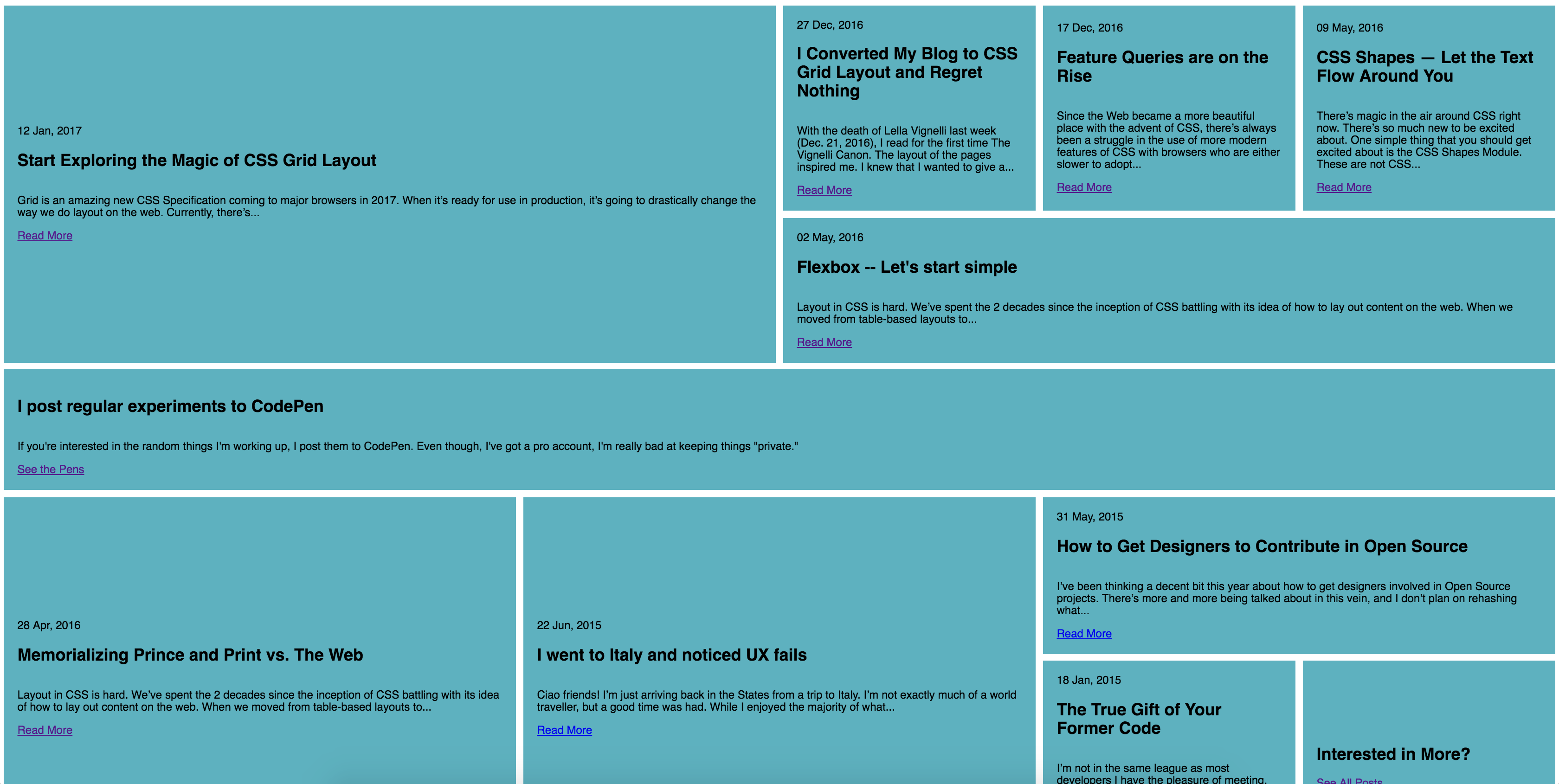
I Converted My Blog to CSS Grid Layout and Regret Nothing
-
Feature Queries are on the Rise
-
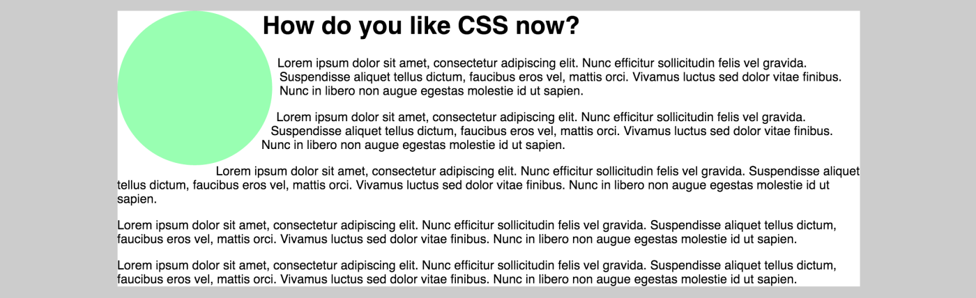
CSS Shapes — Let the Text Flow Around You
-
Flexbox -- Let's start simple
-
Memorializing Prince and Print vs. The Web
-
I went to Italy and noticed UX fails
-
How to Get Designers to Contribute in Open Source
-
The True Gift of Your Former Code