CSS Gap creates a bright future for margins in Flex as well as Grid
One of my many favorite parts of the CSS Grid specification is grid-gap. It makes creating “internal margins” to my grids so much easier.
Margins and the hacks we do to clear them in various contexts have long been one of my primary annoyances with CSS. Grid’s gap just made so much sense.
As it turns out, it made a lot of sense to others, as well. The W3C has recommended switching grid-gap to simply gap and allowing it in Flexbox and Multi-Column.
In this tutorial, we’ll take a look at how we’ve added margins in the past with Flex and how gap makes it so we can have these internal margins with no hacks.
Margins in a simple Flexbox grid
In this example, we’ll take a series of boxes, use Flexbox to create a grid style and then separate the boxes via margins.
We’ll start with basic HTML. A flex-container and multiple flex-items.
<div class="flex-container">
    <div class="flex-item"></div>
    <div class="flex-item"></div>
    <div class="flex-item"></div>
    <div class="flex-item"></div>
    <div class="flex-item"></div>
    <div class="flex-item"></div>
    <div class="flex-item"></div>
    <div class="flex-item"></div>
</div>
We’ll add a small dash of flex to put all the content side-by-side, put in a pinch of a width calculation to size our items and then allow them to wrap with flex-wrap.
.flex-container {
    display: flex;
    flex-wrap: wrap;
}
.flex-item {
    width: calc(100% / 3);
}
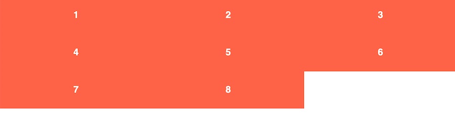
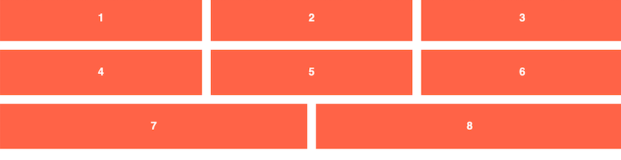
This gives us perfectly sized boxes that are 1/3 the width of our container. Let’s add some margins to put space in between each item vertically and horizontally.
.flex-item {
    width: calc(100% / 3);
    margin-right: 1rem;
    margin-bottom: 1rem;
}
Uh-oh! Our perfectly sized thirds now don’t fit three across in our flex layout anymore! That’s a nice margin between the rows, though!
We’ll need to adjust our width calculation to deal with the additional marginal space. We also need to clear the margin-right from every third item.
We have two 1rem margins now and we need to subtract those 2rem equally from the width of all three items.
flex-item {
    // width: calc(100% / 3);
    width: calc((100% / 3) - (2rem / 3)); // one-third - two margins divided equally among 3 items
    margin-right: 1rem;
    margin-bottom: 1rem;
}
.flex-item:nth-child(3n) {
    margin-right: 0;
}
Does this seem overly complicated? It does to me. There are easier ways to do this, but they also don’t give you perfect 1rem gaps between our columns. This complex code also makes responsive design much more complicated, as well.
Once the gap property is available for use in Flexbox in all browsers, the code gets much cleaner. We can also migrate from setting a width on our items — a slight code smell to me in a Grid world — to using flex-grow, flex-shrink and flex-basis properties.
The Gap way of setting internal margins in Flex
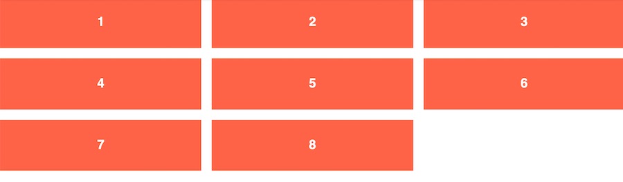
By utilizing gap, we get rid of the need to do most of our width hacking. This also allows us to go back to using flex grow/shrink values
In this case, we still have display: flex and flex-wrap: wrap on our container, but now we also add our gap value. This is a short hand that represents both row and column gaps. Check Mozilla Developer Network’s documentation for all the different methods.
From there, instead of setting a width on each flex item, we’ll set our flex grow, shrink and basis values. flex-basis will be how the browser determines how many columns to create. We’ll still be using a calc() for that, but the resulting code is much cleaner.
.flex-container {
    display: flex;
    flex-wrap: wrap;
    gap: 1rem;
}
.flex-item {
    flex: 1 1 calc((100% / 3) - 2rem);
}
The discerning eye will also notice this allows our last items to grow to fill the space of a row that doesn’t have enough items. Something that Grid won’t do for us and our width-based Flex example won’t do.
Bonus: Gap also makes this easier to take responsive
In our original example, if we wanted to change the number of columns at different break points, we’d have to recalculate our width AND change our nth-child selectors to clear the margins.
In our gap example, all we have to do is reset our flex-basis, and we’re good to go.
.flex-item {
    flex: 1 1 100%; // 1 across at mobile
}
@media (min-width: 640px) {
    .flex-item {
        flex-basis: calc((100% / 2) - 1rem); // 2 across at tabletish
    }
}
@media (min-width: 1024px) {
    .flex-item {
        flex-basis: calc((100% / 3) - 2rem); // 3 across at desktop
    }
}
I won’t lie, I still prefer CSS Grid for a design pattern like this, but hopefully you can see multiple use cases for this amazing new feature.
Looking toward the future
Currently, gap is only supported in Firefox. So, if this article got you excited, I humbly apologize! You’ll need to wait for the other browsers to catch up on this. Hopefully, they take notice of developers’ pain with margins and give us this power sooner rather than later.