Climbing the 11ty Performance leaderboard with Cloudinary, critical CSS and more
A few weeks ago, Zach Leatherman announced that he was going to change the Built with 11ty section 11ty’s documentation. He was going to create a performance leaderboard to showcase performant projects using the tool.
My site wasn’t on there, so I decided to add it in for round 2. I knew I wouldn’t be very high. Most of the top 100 sites from the first run had a Lighhouse score of 100 (a pretty great testament to the 11ty community).
Only the top 200 have a ranking. My site was ranked 187 with a Lighthouse score of 91. Overall, I was happy to be ranked, but accepted the challenge of breaking into the top 100.
A few criteria for increasing my performance rank
While I could have removed all images from my homepage and did a whole bunch of task to superficially bump my score, I wanted to do this to help my site as a whole.
I left my design unchanged. The homepage still has the same number of images as before, the CSS is still creating the same layouts and styles.
This was all to be invisible changes to increase the performance of my site as it stood. No gaming the system. Just good honest performance.
The path from Lighthouse 95 to Lighthouse 100
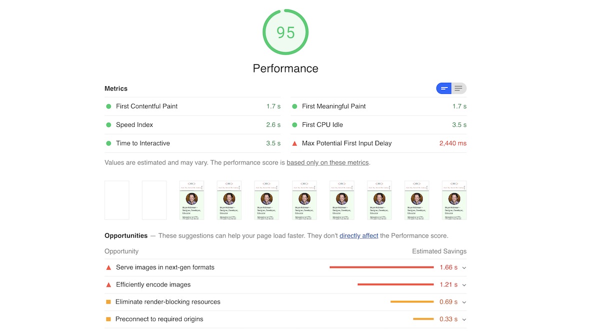
{% respimg “https://bryanlrobinson.com/images/performance-audit/current-audit.jpg” “Current Lighthouse score Criteria as detailed below” “(max-width: 640px) 640px, 900px” %}
I started by running a Lighthouse report on my current site. When run from Chrome’s Audit panel, I registered an 80. When run from the Lighthouse CLI tool — which is what Zach uses — I got a 95.
Here are the score breakdowns from the CLI:
- First Contentful Paint: 1.7s
- Speed Index: 2.6s
- Time to Interactive: 3.5s
- First Meaningful Pain: 1.7s
- First CPU Idle: 3.5s
- Max Potential First Input Delay: 2,440ms
The recommendations were the same either way:
- Serve Images in next-gen formats
- Efficiently encode images
- Eliminate render-blocking resources
- Preconnect to required origins
Let’s take those one at a time.
Dealing with images: Implementing Cloudinary on 11ty
The biggest estimated wins were around images. With those two items, Lighthouse estimated I could save 2.87s off my page load. Nothing to sneeze at!
I could have gone through and optimized the images myself and converted them to “next-gen” formats manually, but that sounded like an on-going pain.
I chose to implement Cloudinary images instead. Cloudinary is a CDN-based media host. You store (or copy) your images into your own personal bucket and then you can enjoy loads of transformations on the images.
This allows a developer to efficiently create responsive images with proper srcset sizes. It also allows for on-the-fly optimizations with just a few query parameters. This gave me those “next-gen” file types served dynamically to browsers that support them. On top of that, it also dynamically sends images that have their quality optimized for speed. Super handy in this situation.
To do this, I used an 11ty plugin: Respimg.
This package automatically connects to Cloudinary and creates base srcsets based on some small configuration. I had it up and running in about 20 minutes. My biggest hurdle was making sure to allow my Cloudinary account to accept “fetch” requests from my domain. The plugin let me keep my main images folder directly in my site’s repository. This let me implement the integration faster.
Code Input in templates with the plugin
{% respimg
  "https://bryanlrobinson.com/images/headshot.jpg",
  "Bryan's smiling face, glasses slightly askew",
  "(min-width: 48em) 200px, 600px",
  "homepage-headshot"
%}
Code Output from the above template tag
<img
  src="https://res.cloudinary.com/brob/image/fetch/q_auto,f_auto,w_640/https://bryanlrobinson.com/images/headshot.jpg"
  srcset="https://res.cloudinary.com/brob/image/fetch/q_auto,f_auto,w_320/https://bryanlrobinson.com/images/headshot.jpg 320w, https://res.cloudinary.com/brob/image/fetch/q_auto,f_auto,w_640/https://bryanlrobinson.com/images/headshot.jpg 640w, https://res.cloudinary.com/brob/image/fetch/q_auto,f_auto,w_960/https://bryanlrobinson.com/images/headshot.jpg 960w, https://res.cloudinary.com/brob/image/fetch/q_auto,f_auto,w_1280/https://bryanlrobinson.com/images/headshot.jpg 1280w"
  sizes="(min-width: 48em) 200px, 600px"
  alt="Bryan's smiling face, glasses slightly askew">
I did move away from using the plugin and created my own local version of it. There were two features I felt were missing: ability to add a class to the image and the ability to use loading=lazy on the image. With my local version, I implemented both. I may go back and submit them to the package at a later time.
New Template Syntax
{% respimg
    "https://bryanlrobinson.com/images/headshot.jpg",
    "Bryan's smiling face, glasses slightly askew",
    "(min-width: 48em) 200px, 600px",
    "homepage-headshot"
%}
New Output
<img
  loading="lazy"
  src="https://res.cloudinary.com/brob/image/fetch/q_auto,f_auto,w_640/https://bryanlrobinson.com/images/headshot.jpg"
  srcset="https://res.cloudinary.com/brob/image/fetch/q_auto,f_auto,w_320/https://bryanlrobinson.com/images/headshot.jpg 320w, https://res.cloudinary.com/brob/image/fetch/q_auto,f_auto,w_640/https://bryanlrobinson.com/images/headshot.jpg 640w, https://res.cloudinary.com/brob/image/fetch/q_auto,f_auto,w_960/https://bryanlrobinson.com/images/headshot.jpg 960w, https://res.cloudinary.com/brob/image/fetch/q_auto,f_auto,w_1280/https://bryanlrobinson.com/images/headshot.jpg 1280w"
  class="homepage-headshot"
  sizes="(min-width: 48em) 200px, 600px"
  alt="Bryan's smiling face, glasses slightly askew">
With this one change, I took my speed index from 5.0s to 2.2s and jumped my Lighthouse score to 97.
Inlining my CSS to reduce “render blocking resources”
The main issues with “Render Blocking Resources” are my CSS files and my Google Fonts. To fix this, we want to inline at least the critical CSS, but I decided to take it all the way to embed all our CSS on pages.
I started out by attempting to break my CSS up into components and use Nunjucks {% raw %}{% include %}{% endraw %} tags to bring them onto the page.
This worked, but I went down quite a few rabbit holes on how I wanted to structure this. Nothing felt quite right. I felt like I was fighting against my templates instead of them working for me. I went looking for a new solution.
I’ve followed Andy Bell for a while, and I love the way he thinks about things. I knew he’d done some work around inlining styles in 11ty, so I went perusing his GitHub repos.
On one of his latest “fun” sites — the awesome “Thanks for the Reply, Guy” site — had just the thing I was looking for.
He had created a “helper” function to handle concatenation and minification of CSS from a base set and a layout-specific set. This was perfect and I won’t lie, I ripped it right off! The great thing about it is that it gets to just be a JS data file in 11ty’s structure. Because 11ty has no issues with JS, you can run these functions as variable calls from your templates.
It’s really kind of genius, to be honest. I’d never thought of data files like that.
const fs = require('fs');
const uglifycss = require('uglifycss');
const path = require('path');
const cssDir = path.join(__dirname, '..', '_includes', 'css');

module.exports = {
  getCSS(coreStyles, layoutStyles) {
    let css = '';
    let partials = [];
    if (coreStyles) {
      partials = [...partials, ...coreStyles];
    }
    if (layoutStyles) {
      partials = [...partials, ...layoutStyles];
    }
    if (partials.length) {
      partials.forEach(partial => {
          const cssPath = path.join(cssDir, partial);
        css += fs.readFileSync(cssPath);
      });
    }
    return uglifycss.processString(css);
  }
};
In my base.njk template, I use the helper to create an embedded style block with <style></style>, and use Nunjuck’s set blocks to create an array to our various CSS files.
I made a few changes as I went to handle things the way I needed. Mostly, I stripped out some fancy functionality for handling resets. I also changed the way the CSS files were found. Andy was working by copying the CSS files from his _includes to his _data directory using a tmp directory. This felt a little extra for me, so I used the Node path functionality to find where my CSS files lived.
Then, it was just a matter of breaking up my CSS into components. When I redesigned my site, I made the choice not to use a preprocessor, so I had to do that thinking now.
{% set coreCSS = [
    'base.css',
    'banner.css'
  ]
%}

<!-- On different layout files, we also set layoutCSS as a variable -->
{% set layoutStyles = [
    'articles.css',
    'components/article-promo.css',
    'components/ad-space.css',
    'components/related-list.css'
  ]
%}

<style>
  {{ helper.getCSS(coreCSS, layoutStyles) | safe }}
</style>
With my CSS inline, I now ran the risk of my initial HTML file being a big load. From there, I used a “transform” in 11ty to minify the HTML of each page. I, honestly, hate minified HTML, but I DO see how it can be super helpful to minimize file size of the initial download.
With these changes, I took my Lighthouse score to 99. So close! After perusing the leaderboard, I realized I would need a score of 100 to guarantee a placement in the top 100 sites.
Preconnect external resources and handle Google fonts asynchronously
As it turns out, the browser can be told to expect external connections. By telling the browser what domains it should expect to connect to, it can do some work behind the scenes to get ready for it even before a request is made.
To do this, you can create a new <link> tag in your header for each domain.
<link rel="preconnect" href="https://domain.com">
I did this for Google Analytics (which I should just remove, but I do like measuring my imaginary friends), Google fonts and Twitch (for an API call I make).
These last changes bumped me up to a score of 100!
We’ll see this weekend — and I’ll report back — if I break the top 100. If the sites remain as is, I should see that happen.
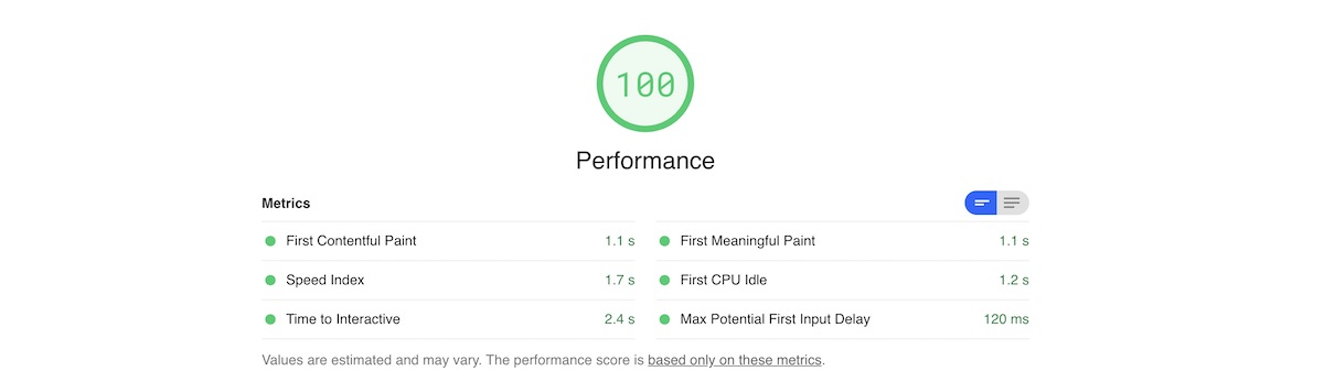
Final Results! Performance Score of 100
{% respimg “https://bryanlrobinson.com/images/performance-audit/after-changes.jpg” “Final results: Performance score up to 100. Details follow” “(max-width: 640px) 640px, 900px” %}
- Performance Score: 100 (5 points up)
- First Contentful Paint: 1.1s (.6s decrease)
- Speed Index: 1.7s (.9s decrease)
- Time to Interactive 2.4s (1.1s decrease)
- First Meaningful Paint 1.1s (.6s decrease)
- First CPU Idle: 1.2s (2.3s decrease)
- Max Potential First Input Delay: 120ms (2,320ms decrease)
Why is this important?
With so many cool things happening the JAMstack recently, I think we should always keep an eye on performance. Many frameworks can sacrifice speed for developer convenience. The ideas behind hydration and rehydration can sometimes negatively impact this as well. First render is quick, but first useful render can be tediously slow.
I love that 11ty has decided to prominently call out sites that are doing well in this regard. It shows their goal of performant, HTML-driven sites.
What can you do to improve your sites. Take a couple hours, see what the Lighthouse audit shows you and make some changes. Let me know on Twitter how it went!