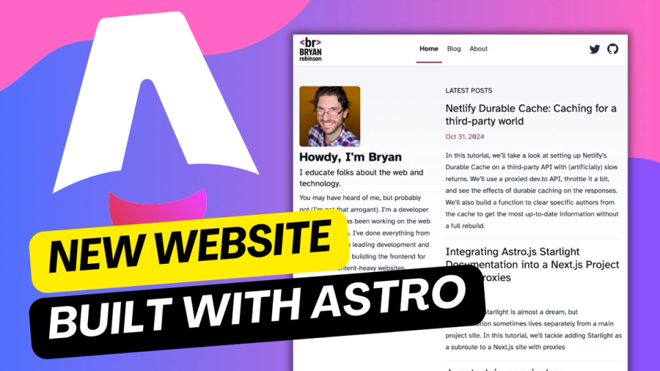
New Website, but really is it?

So, you're on my new website. Awesome!
Welcome!
There's really not a whole lot to tell, so let's go bulleted list here:
- It's using Astro, which I've really been enjoying
- It's a modification for Astro's standard blog. The code was decent, the design was decent, it's so much simpler than my last rewrite
- I've removed a lot of old functionality that didn't really matter. In the end, no one was reaching out via the couple forms I had, so why keep them?
- As a subnote on that, we don't have category pages yet, but... those were only getting minor traffic. I'll reimplement them at some point.
- I'm hoping the SEO value won't take a hit, but I'm also not super concerned.
- As usual, this solidifies my opinion that a CMS is better than just markdown. My Sanity blog posts all came through with minimal effort... my Markdown blog posts required a bit of a massage...
- Going away from a ton bespoke CSS. My last site was in my "Let's do weird, fun things in Grid" phase. I'm out of that phase, but still appreciate Grid.
- I want to write a bit more on here, so I wanted things to be simpler overall. I think it is...
- I also wanted things to look a bit more modern. Astro's basic theme hit that, so I went with it.
- Migrating was relatively easy. I had to convert my markdown's frontmatter a bit. I then had to rewrite the adapter I've got for importing my Sanity posts and integrating them with my Markdown posts. That just required some tweaks from my 11ty code. I want to write an Astro Content Loader that pulls posts from one source and puts them with Markdown, but not sure I'll find time for that in the immediate future
- Oh! I redid my logo. Nothing major, but color scheme changed and made IT much simpler and less grungy, too. Still like the concept of the <br> tag as my log, so that stayed.
All in all, I'm pleased with it. Is it an Earth-shattering amazing website? Nope! But it's still my little corner of the web.