I went to Italy and noticed UX fails
Ciao friends! I’m just arriving back in the States from a trip to Italy. I’m not exactly much of a world traveller, but a good time was had. While I enjoyed the majority of what I saw, I also observed a few major usability fails that I wanted to bring up. Give the blog a little international flair.
Optimal viewing for artwork
The Uffizzi Gallery in Florence is home to amazing works of art. The main point of interest for me was Botticelli’s The Birth of Venus. It lived up to the hype.
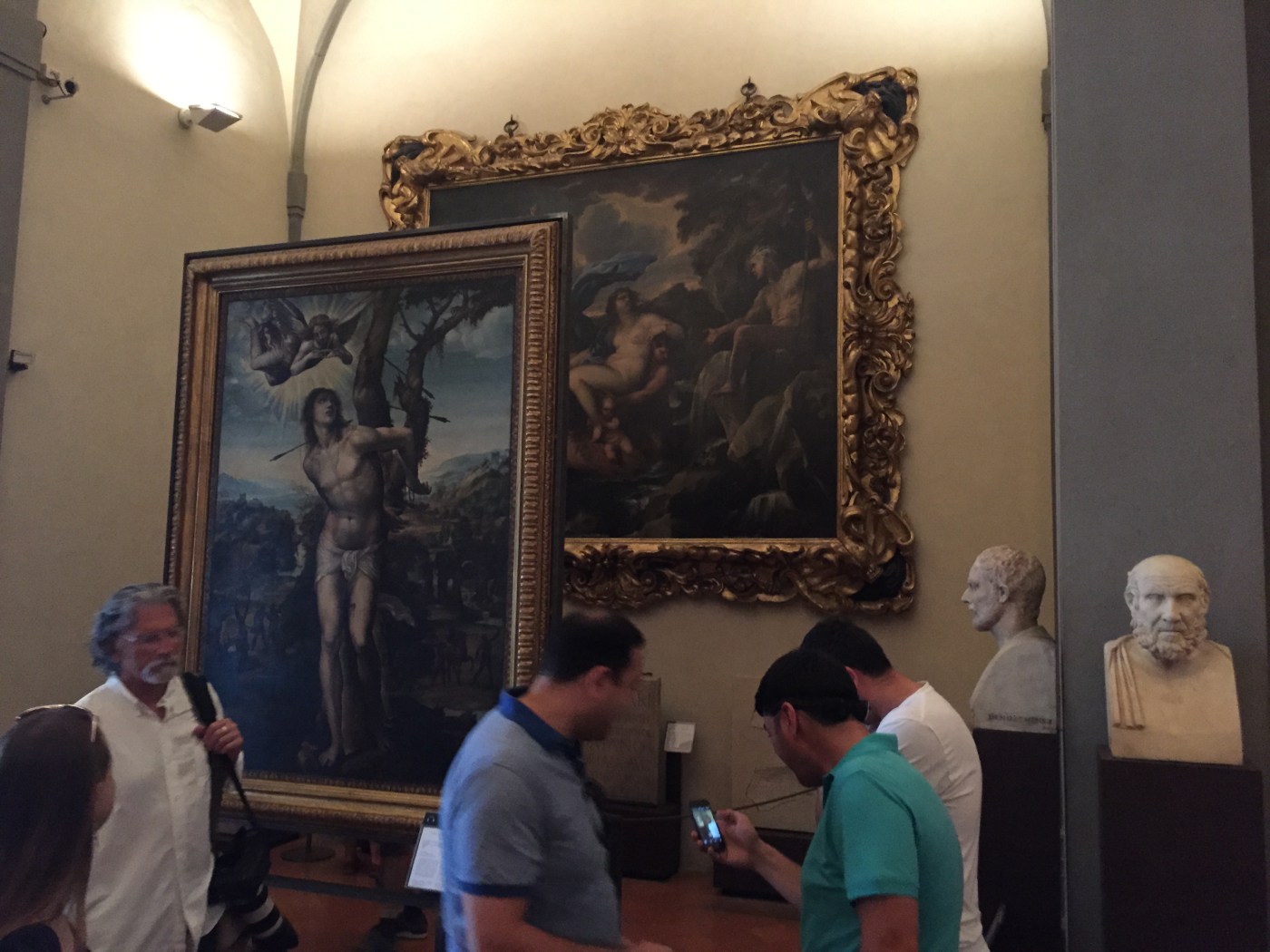
However, going through some of the other galleries, I observed this.

The work in the back — the name of which I can’t remember — is nearly impossible to observe at the proper distance to appreciate it. You have to walk behind the piece in front. I’m by no means an art aficionado, but this seems to be a large fail by the gallery.
The Road Ways
There’s a feeling you get walking around the roads of Italy, a feeling that your life is no longer in your hands. Roads lead to piazzas — open air plazas — which often times have no demarcation between pedestrian areas, car areas and even lanes. These leads to some very awkward situations and the occasional harrowing journey to the other side.
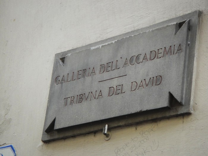
The other issue we ran into with the roadways in Italy (mainly Rome and Florence) was navigation. The street signs, when they existed, were cement signs put on the sides of buildings. This definitely looked nice, but was very hard to see.

These signs fade into the background of most buildings on which they reside. It took us a couple days to get used to it, and even then it made finding our way around incredibly difficult.
Overall, the trip was awesome, just found it interesting to see some UX fails from the real world overseas.
Bonus UX Win
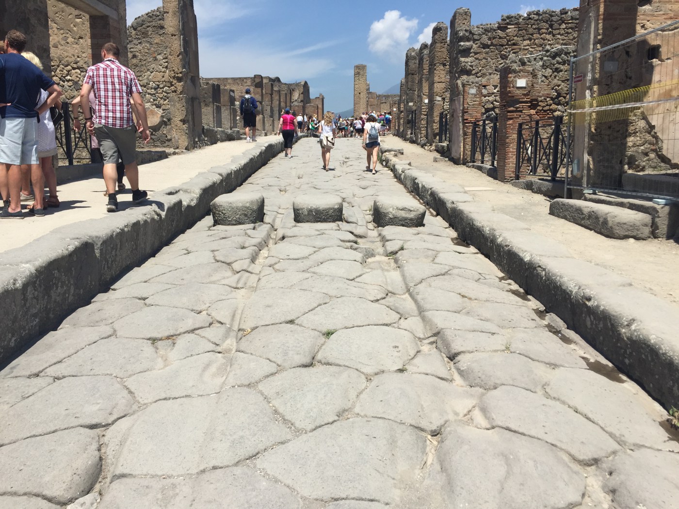
We took an amazing tour of Pompeii and saw the city that was destroyed by Mount Vesuvius. One great accomplishment was on the main road through town. It acted as a road for chariots AND for the sewage to run down.
This required a way for pedestrians to get across without walking through the refuse, but also needed a way to slow the chariots down as they came into the populated areas of town. Enter an amazing Roman-designed speed bump. It has channels through which chariot wheels and sewage can pass easily and acts as stepping stones for pedestrians to cross the street without needing to bury their feet in some nasty liquids.
Truly amazing engineering from the past. Have a photo
