Can CSS Grid open up interesting CMS Layout options?
I love hand crafting layout in CSS Grid. Ask my co-workers. They’re tired of hearing about it.
Nothing is going to stop me from hand-coding my CSS. What about people who write no CSS, though? Can we use Grid to open up a world of new layout options to CMS users?
That’s not a rhetorical question. I want to hear opinions on this.
I’ve created a very simple prototype. To all my friends who write good JavaScript, I apologize. Don’t look at the JS panel and you’ll be happier. The CodePen is here and embedded at the bottom of the article.
In this example, there are three components on a six-column grid. The doesn’t have rows specified, but is adjusting the implicit rows via grid-auto-rows.
{% include ad-space.html %}
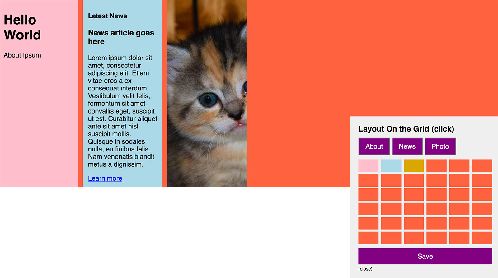
With simple markup and ugly JavaScript, I created an interface to let a user select grid areas. Using this interface, a user can take this layout:

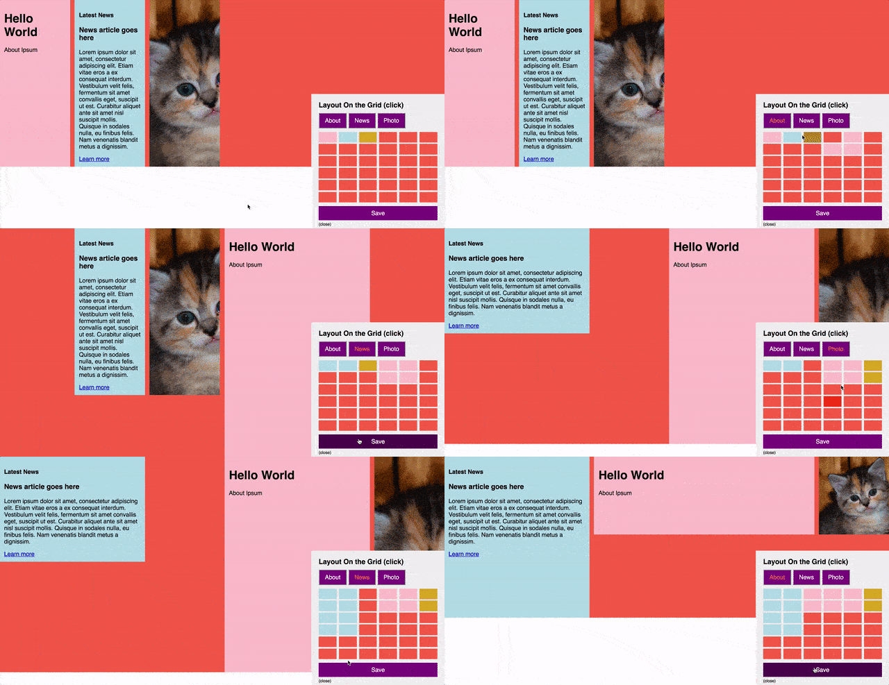
And change it to these layouts:

As a CSS purist, I’m always wary of ceding my control over to JavaScript or a CMS database. Does this enable a CMS user more interesting controls than otherwise possible?
Try it for yourself
Keep in mind, you’ll need at least Firefox 52 or Chrome 57.
See the Pen Grid CMS Interface by Bryan Robinson (@brob) on CodePen.
What do you think? Good idea? Bad idea? Overkill?
Keep in mind before answering, I know that Grid is in its infancy of support. These are important questions for the future.