CSS Grid Layout has been in major browsers for a little less than a year now. Despite the excitement around it by people in the know, not everyone has jumped on board.
I understand. Despite its browser adoption happening in record time, we still live in an IE world sometimes.
While 2017 was the year of CSS Grid's browser adoption, 2018 will be the year of its developer adoption.
If you're wondering how to start, here are three strategies for adopting it into your workflow.
Reduce Excessive Markup
Our appetite for better designs has increased in the past five years. With that -- and our reliance on old layout techniques -- we've seen an explosion in nested markup.
Take this simple promotional grid layout for example.
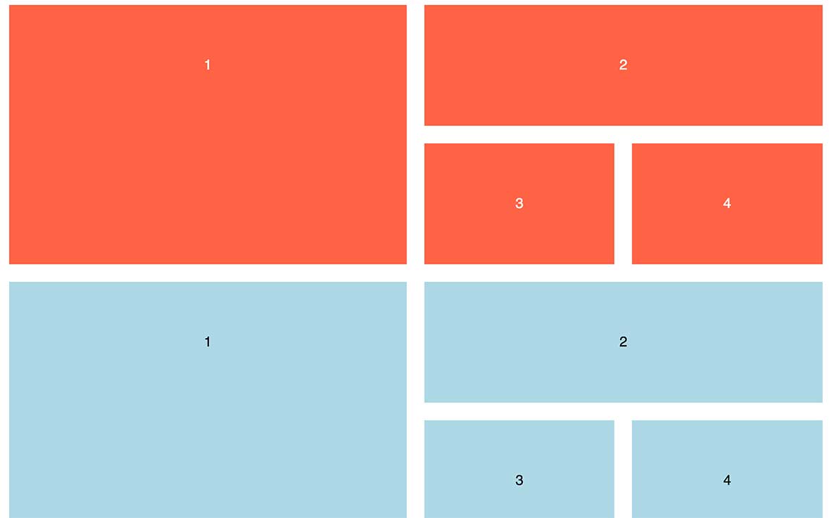
To make this happen, we have to introduce a slew of markup to add rows inside of rows.
<section class="flexgrid">
<div class="left-side">
    <div class="item">1</div>
</div>

<div class="right-side">

    <div class="right-top">
        <div class="item">2</div>
    </div>

    <div class="right-bottom">
        <div class="item">3</div>
        <div class="item">4</div>
    </div>

</div>
</section>
Keeping track of the nesting is a headache. It also fights against clean, semantic HTML.
Let's take the same design and build out the HTML we need for CSS Grid.
<section class="grid">
    <div class="grid__item">1</div>
    <div class="grid__item">2</div>
    <div class="grid__item">3</div>
    <div class="grid__item">4</div>
</section>
With one parent and four direct children, we can pull off uneven rows and columns.
The promise of Grid Layout is the promise of semantic markup and true separation of concerns.
View my CodePen of the layouts side-by-side
Build a Multi-Column Form
While you're simplifying your markup, you might as well take a look at upping your form game.
Sure a one-column form will get the job done, but why not add a little spice with multiple columns.
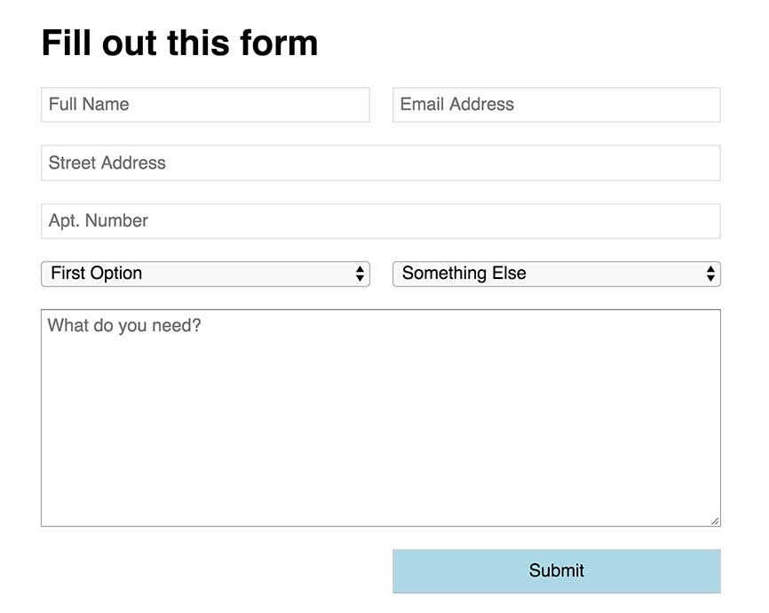
Instead of setting up rows of content inside of a form, tell the form to be two columns and let certain areas stretch.
In this example, we want the street address and comment box to have more room for comfortable writing.
By creating a "fullwidth" class that uses grid-column: span 2, we can have a single input change its layout. The other inputs that can be smaller remain side by side.
.form {
    display: grid;
    grid-template-columns: 1fr 1fr;
    grid-gap: 20px;
}
.fullwidth {
    grid-column: span 2;
}Use Grid Layout instead of the Bootstrap or Foundation Grid
I try to write a lot about Grid Layout bringing new design options to the table, but sometimes it's worthwhile to use tested methods.
If you want to take a baby step into Grid, try recreating your 12-column Bootstrap or Foundation grid.
Start with a simple grid declaration and setup.
.grid {
    display: grid;
    grid-template-columns: repeat(12, 1fr);
    grid-column-gap: 10px;
}
From there, you can set up classes that span various column counts.
.span3 {
    grid-column: span 3;
}
.span9 {
    grid-column: span 9;
}
I bet you can figure out the rest.
If you're looking to get started, this is an easy shift in your workflow. This isn't the best use of Grid. Start expanding your mindset to work outside of traditional ideas of what a grid is.
Bonus: Make a Responsive Grid with No Media Queries
One of the absolute coolest features in Grid layout is the combination of repeat() and minmax() functions.
I wrote a blog post on how to make a fluid grid of cards with no media queries. It's pretty slick.
Start Experimenting with Grid
More than anything else, this represents a shift in the way we develop websites. It will require you playing and working in it.
Whatever strategy you implement to learn Grid, start learning it.