CSS Tip: Use rotate() and skew() together to introduce some clean punk rock to your CSS
In 2018, the web design industry is going to start looking very different. Literally.
With all the tools we’re gaining in CSS, designers are going to have new ability to experiment. I wrote about some of those tools on CSS Tricks: Five Design Fears to Vanquish with CSS Grid.
I’m still convinced that taking inspiration from punk rock design of the 70s and 80s is going to be a trend.
If you want to start small, introduce some angles to your design. This is a simple trick to angle a stripe of content without adding awkward white space.
{% include ad-space.html %}
Start with a regular stripe
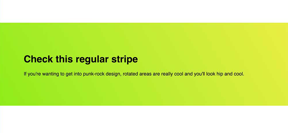
We all know this design pattern: full width background and nice promotional content.
We set up very simple markup:
<section class="stripe">
    <h1>Check this regular stripe</h1>
    <p>If you're wanting to get into punk-rock design, rotated areas are really cool and you'll look hip and cool.</p>
</section>
Add a pinch of very simple CSS and we’re done.
.stripe {
    background-image: linear-gradient(240deg, #eaee44, #90ec19);
    padding: 5rem;
}
This is a lovely serviceable stripe of content. You also get to dig on a nice linear-gradient while you’re there.
Use transform: rotate() to introduce the angle
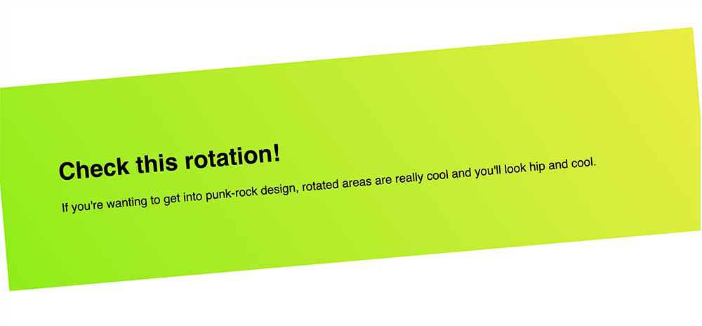
The transform CSS property has a load of great functions. One of the easiest functions to use is rotate(). It takes an angle unit such as 45deg and rotates the element by that amount. A positive integer is a clockwise turn and negative is a counter-clockwise turn.
.stripe {
    background-image: linear-gradient(240deg, #eaee44, #90ec19);
    padding: 5rem;

    transform: rotate(-5deg);
}
You’ll notice from the photo that this introduces an issue. This is still a rectangle and by rotating the rectangle, we see the corners.
This doesn’t feel professional, so we need this to stay flush to the browser edge.
skew() to the rescue
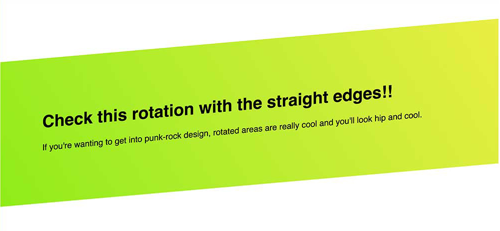
By taking the same angle we used in our rotate() function, we can skew the element back. This angles the left and right sides of our element back to their starting points.
The transform property can take multiple functions, so we apply it on the same line of CSS.
.stripe {
    background-image: linear-gradient(240deg, #eaee44, #90ec19);
    padding: 5rem;

    transform: rotate(-5deg) skew(-5deg);
}
The discerning designer eye will notice one more issue with our implementation. The text is now skewed. This may be something you want. The skewed text bothers me slightly, so let’s unskew it.
Time to unskew the text
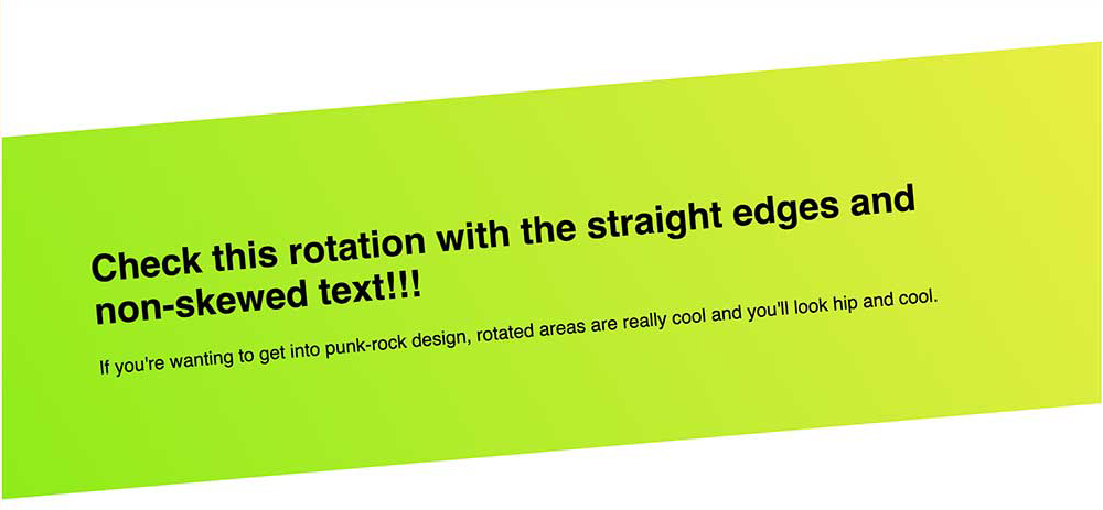
I’m not a huge fan of introducing new markup for styling if I can avoid it, but with the introduction of a content container, we can fix our text skew.
Chances are decent, you had a container here anyway to set a width on your content.
By applying a skew of the negative angle we’ve been using, the text will re-skew back to its initial angle. You can also use this method to un-rotate the text, as well, if that’s your need.
Full Markup:
<section class="stripe">
    <div class="stripe__content">
        <h1>Check this rotation with the straight edges and non-skewed text!!!</h1>
        <p>If you're wanting to get into punk-rock design, rotated areas are really cool and you'll look hip and cool.</p>
    </div>
</section>
Full CSS:
.stripe {
    background-image: linear-gradient(240deg, #eaee44, #90ec19);
    padding: 5rem;

    transform: rotate(-5deg) skew(-5deg);
}
.stripe__content {
    transform: skew(5deg);
}
This gives us clean lines with a hint of punk rock. See this in action on CodePen.
If you’re still doing things the same way you’ve always done them, it’s time to spice things up. Adding angles is an easy and painless way of tossing some cayenne into your design process.