How To: Use CSS Grid Layout to Make a Simple, Fluid Card Grid
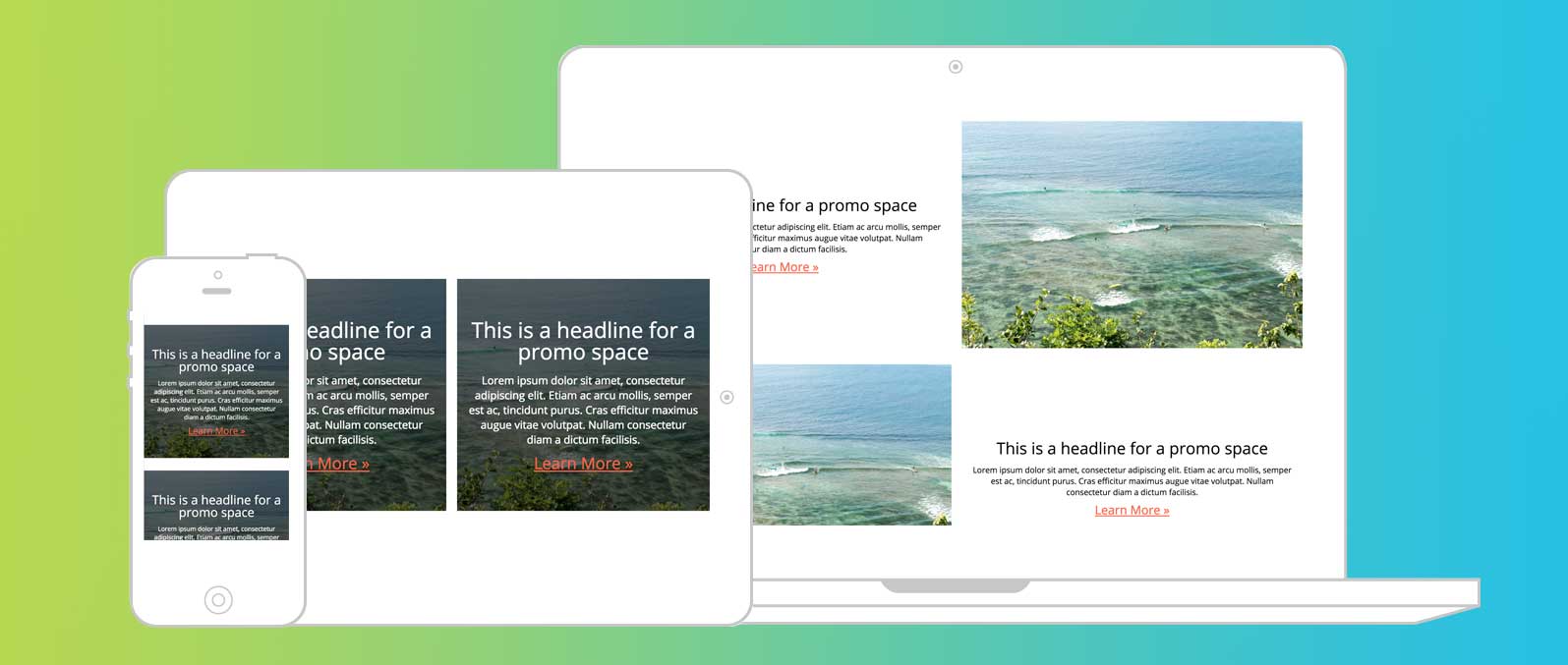
In this tutorial, I’m going to show you how to take one of the most common tropes of web design — the card grid — and make it fluid.
We could build this via a float- or flex-based grid and a handful of breakpoints. Why deal with breakpoints if Grid Layout can handle everything for us?
Grid can do so much more than recreating old design patterns. If you’re looking for a good place to start, though, this is the best introduction to its power.
Video: For those who learn by watching
Step 1: Create your markup
In this example, I’ve got a simple card with a title, photo, description and link. I’ve duplicated this markup 10 times to have content to show the grid in action.
Place all the .card items inside a .card-container element.
<section class="card-container">
    <article class="card">
        <header class="card__title">
            <h3>Hello World</h3>
        </header>
        <figure class="card__thumbnail">
            <img src="http://placekitten.com/700/287">
        </figure>
        <main class="card__description">
            Lorem Ipsum dolor amet sun Lorem Ipsum dolor amet sun Lorem Ipsum dolor amet sun
        </main>
        <a href="#" class="button">Call to Action</a>
    </article>
</section>
{% include ad-space.html %}
Step 2: Visually style your cards
In this case, I chose very simple style elements. You can style your cards however you would like. Keep in mind that your styles and cards should work at multiple sizes, as we’re building a fluid grid. Don’t use direct pixel values to avoid odd spacing.
.card {
    box-shadow: 0px 1px 5px #555;
    background-color: white;
}
.card__title {
    font-size: 2rem;
    padding: .5rem;
}
.card__description {
    padding: .5rem;
    line-height: 1.6em;
}
.button {
    display: block;
    background-color: tomato;
    padding: 10px 20px;
    color: white;
    text-decoration: none;
    text-align: center;
    transition: .3s ease-out;
}
Step 3: Define your Grid
We’ll start by changing the display value of our .card-container from “block” to “grid.” This will create the grid context for the cards.
Using that context, we’ll define our “grid-template-columns.” This is where the fun begins. We could specify a finite number of columns, but then we’d be in the same situation as a flex or float grid.
Instead, we’ll use the power of some special keywords to create a fluid amount of columns per row.
3A: repeat(repeat value, size value)
First, we’ll use the “repeat()” function. repeat() takes two arguments: number of times to repeat and the value to repeat.
For Example:
grid-template-columns: repeat(3, 100px)
will compute to
grid-template-columns: 100px 100px 100px
3B: auto-fit
Next, instead of specifying a finite number of times to repeat, we’ll use the “auto-fit” keyword. This will tell the browser to have as many columns as will work based on the size specified in the repeat syntax. There’s also “auto-fill” which works the same. The difference between the two is what happens with extra tracks (see Rachel Andrews’ Grid By Example).
3C: minmax(smallest size, largest size)
Replacing the size value in our repeat() function will be a minmax() function. minmax() allows you to specify the smallest and largest you want a track to be.
In our example, we want our cards to be able to size down to fit in mobile (I use 320px for this) and size up to be a fraction of the space available. Thus, our minmax() function will be
minmax(320px, 1fr)
Put all this together and you get a CSS declaration block that looks like this:
.card-container {
    display: grid;
    grid-template-columns: repeat(auto-fit, minmax(320px, 1fr));
}
Step 4: Spacing
We now have a fluid grid, but all our cards are jammed together. Instead of reaching for our old stand-by “margin,” we’ll use another new property: grid-gap.
Grid-gap will place a space between the tracks of our grid (columns and rows). This doesn’t add space around the grid, so we’ll couple that with some padding of our container. Our CSS is now complete and looks like this:
.card-container {
    display: grid;
    padding: 1rem;
    grid-template-columns: repeat(auto-fit, minmax(320px, 1fr));
    grid-gap: 1rem;
}
And voila! A fluid, responsive grid created with no breakpoints.
Below is the CodePen that contains this example in its entirety. If you have any questions, post them in the comments or feel free to contact me on Twitter. If you’re interest in implementing Grid and still supporting older browsers, take a look at this post.
See the Pen MvwbMa by Bryan Robinson (@brob) on CodePen.
Next Up: Learn how to mix and match design patterns for each screen size
See the power of grid in creating different layouts for different screen sizes with the simplest media queries.