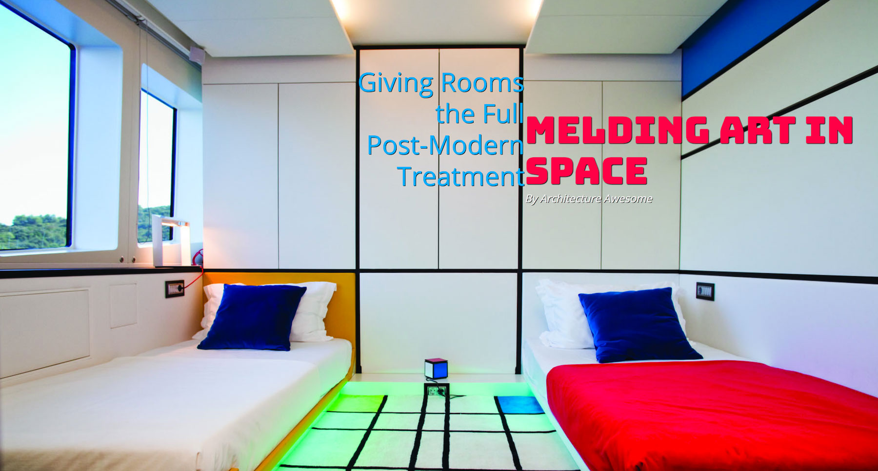
Our design trends are about to get a facelift. Grid Layout is coming in the next release of modern browsers. It's important to get a grip on its utility.
Let's take a common trend in editorial and marketing design: the "cover page" banner area.
At its simplest, this contains five elements: headline, subhead, byline, photo and photo credit.
This is a bold design pattern.
With current CSS, it's also a static design pattern. Each article detail page is laid out the same. The only difference is the background image.
With CSS Grid, we take similar markup on each page and can apply unique layout. This opens the door to art direction for each article.
Author's note: For simplification the examples in this article won't use Feature Queries to ensure support. See my post on Feature Queries for more information on implementing Grid while supporting non-compliant browsers.
Second author's note: I can envision some great CMS interfaces using this method. Selectable grid areas in a CMS would be amazing and super flexible.
To get to the point of flexibility, we first have to set up our template. The .headline, .subhead and .secondary are all children under our grid container.

.cover {
box-sizing: border-box;
width: 100%;
height: 100vh; // Always 100% of the viewport's height
padding: 20px;
display: grid;
grid-template-rows: 1fr 1fr 1fr 1fr 1fr; // 5 rows
grid-template-columns: 1fr 1fr 1fr 1fr 1fr; // 5 columns
grid-gap: 5px; // 5x5 works well for centering
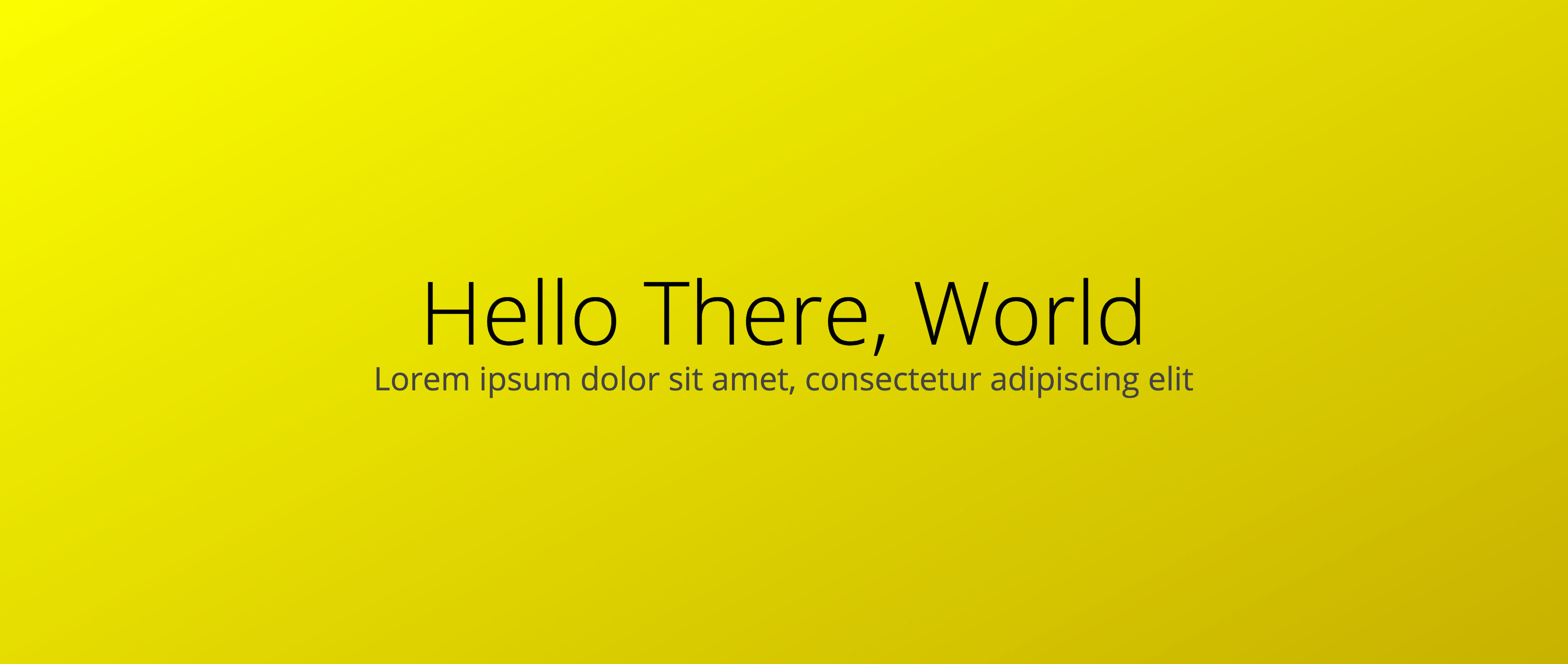
}After we write our HTML and set up our grid in CSS, we're ready to place our content. Here's an example of the basic "cover" layout:
To layout a headline, subhead and caption this simply, Grid may be a bit of overkill. Here's the code for the image above:
.headline {
        grid-row: 3;
        grid-column: 2 / 5;
        text-align: center;
        align-self: center;
        align-self: end;
    }
    .subhead {
        grid-row: 4;
        grid-column: 2 / 5;
        text-align: center;
    }
    .secondary {
        grid-column: 4 / 6;
        text-align: right;
    }
Flexbox and absolute positioning would probably have made this easier. This setup also allows us to use the 5x5 grid to create new and powerful combinations based on the same markup.
We can allow our image to dictate the needs of our content. We can also allow the text to speak to our articles theme. In other words, we can art direct on the web (inspiration from Jen Simmons for this language).
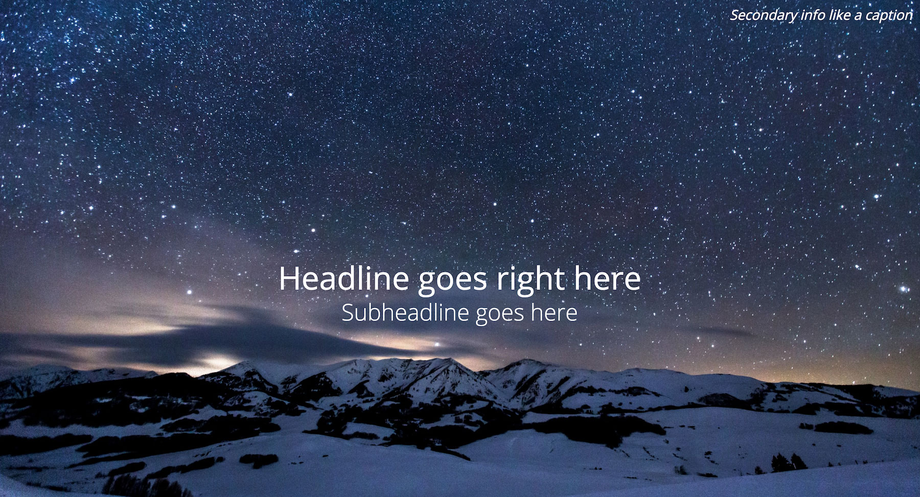
Example 1: Skyline

In our first example, we've got a beautiful shot of a city skyline blazing in the night.
There would still be impact if we left our headline in its default position, but the headline will compete with the image. What if the text could mirror the shape of a skyscraper? What if it could also fit within the negative space afforded by the walkway?
.headline {
        grid-row: 2 / 6;
        grid-column: 3 / 4;
        text-align: center;
        align-self: end;
    }
    .secondary {
        grid-row: 5 / 6;
        grid-column: 4 / 6;
        text-align: right;
    }
Example 2: Connecting eye line to headline
The images we choose can also help direct a user's eye where we want it to go.

Not only does this image have a striking subject and color scheme, it also places its subject in an awkward spot for designers.
In this example, we can eschew the tradition of placing our headline at the center or on the left side of the screen. Instead, we work with our image to allow the woman's eye line to connect the user to our headline in an atypical design.

Again, we can simply change our CSS to change our layout. No need to modify markup.
.headline {
        grid-row: 2 / 5;
        grid-column: 5 / 6;
        text-align: right;
        font-family: 'Stalemate', cursive;
    }
    .subhead {
        grid-column: 3 / 6;
        grid-row: 6;
        text-align: right;
    }
    .secondary {
        grid-row: 6;
        grid-column: 1 / 3;
    }
More examples
Here are other screenshots for ways of laying out content in a cover page via the same grid and markup we've used so far. All of these layouts are available to play with in my CodePen collection. If you use them in CodePen, keep in mind, you'll need to have a Grid-enabled browser.