Start Exploring the Magic of CSS Grid Layout
Grid is an amazing new CSS Specification coming to major browsers in 2017. When it’s ready for use in production, it’s going to drastically change the way we do layout on the web.
Currently, there’s no real browser support. Edge and IE10/11 “support” grid, but they implemented an early version of the specification and it’s significantly broken.
To my way of thinking, there are currently three camps in the discussions around CSS Grid Layout: “I think this is amazing,” “I don’t see the use case, I’ll stick with flexbox” and “That’s great, but I won’t be able to use it for the next 5 years so what’s the point?” I hope this will begin to chip away at the two negative points of view to take a deeper look into Grid and provide my buddies in the “amazing” crowd with some basics to start playing with the specification themselves.
“Flexbox is for one-dimensional layouts - anything that needs to be laid out in a straight line (or in a broken line, which would be a single straight line if they were joined back together). Grid is for two-dimensional layouts. It can be used as a low-powered flexbox substitute (we’re trying to make sure that a single-column/row grid acts very similar to a flexbox), but that’s not using its full power.”
For simple rows of content, Flexbox is still what you want to use. It works really well for flexible content flowing in one direction. Grid comes in when you want to place and stretch content blocks across both the horizontal and vertical axes.
Let’s walk through a very simple implementation to see the difference.
In this video, I take some very simple markup and apply a very simple grid layout to it, emphasizing the concept of multi-dimensional layout.
With very simple styling, we can make a div span across not just horizontal borders, but across vertical as well. Something that requires much more markup for Flexbox to accomplish.
If you’re looking for a little more spice to your layout or wanting to do mosaic tiling — in the sense of a “Pinterest” layout — you can use a few more properties and create various sized divs that automatically have any holes in the layout backfilled by a placement algorithm that’s now going to be built into the browser.
Instead of relying on JavaScript libraries like Masonry, we can handle all of this in CSS by using the grid-auto-flow property and setting it to ‘dense.’
This is just the tip of the iceberg when it comes to Grid Layout and the fun really begins when you start placing real content on the page.
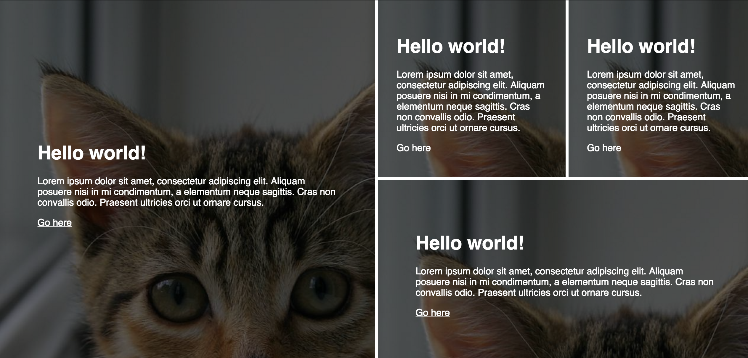
Take a look at this simple banner concept done in Grid on CodePen. It would require three more container divs to truly make this design work in just Flexbox. I wouldn’t even attempt this layout with floats, personally.
If you don’t have Grid enabled yet, here’s an image to see what’s interactive in the screen above:
Grid is going to allow us to have cleaner, more semantic markup and change layout on the fly much easier in CSS without having to reorder elements on the page.