I Converted My Blog to CSS Grid Layout and Regret Nothing
Update May 15, 2017
Since I published this piece, I've since converted even more of my site over to CSS Grid. If you're interested in my take on how to "Fallback" with CSS Grid, check out my post Falling Forward — Rethinking Progressive Enhancement, Graceful Degradation and Developer Morality from January.
With the death of Lella Vignelli last week (Dec. 21, 2016), I read for the first time The Vignelli Canon.
The layout of the pages inspired me. I knew that I wanted to give a quick update to some of my blog posts to mirror some of the design from that book — a book that talks about grids, as well.
To do this, I decided to convert my blog posts to CSS Grid Layout.
With the release of this blog post, I’m also releasing the updated code into the wild.
This is a super simple implementation and doesn’t look quite right in the Firefox Developer build, due to height bugs (more in author’s note), but it’s really nice in other experimental browsers — such as Chrome with the experimental flag checked.
I’ve only converted one other blog post to the new layout at this point. Fittingly, it’s my post on Grid and Feature Queries.
I won’t dive into too many details, but here’s a snippet of some of the CSS I’m using to accomplish this layout.
.post {
    /* Sets this to be a grid,
    defines the columns and adds margin between rows */

    display: grid;
    grid-template-columns: 1fr 1fr 1fr 1fr 1fr;
    grid-row-gap: calc(.8rem + .5vw);
}

.post > p, .post > iframe, .post > .highlight {
    /* Sets my blog content to span the last 3 columns
    (using > p instead of a class
    to make my life easy with markdown) */

    width: 100%;
    grid-column: 3 / span 3;
}

aside {
    /* Sets asides to start at the first column line
    and spans the aside 2 columns */
    grid-column: span 2;
}
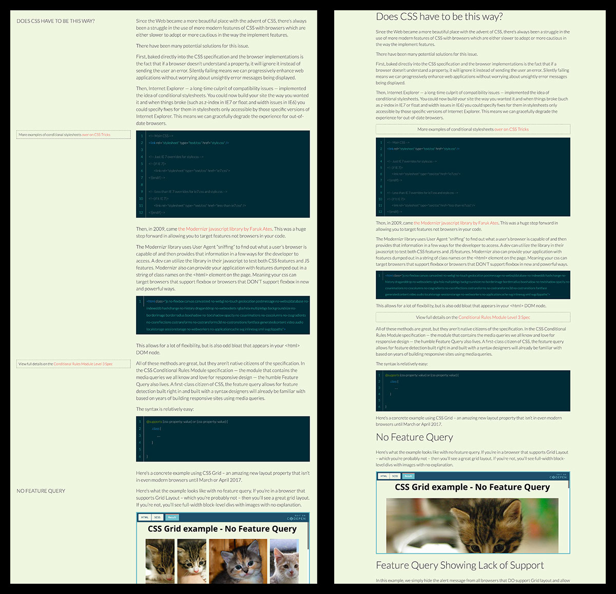
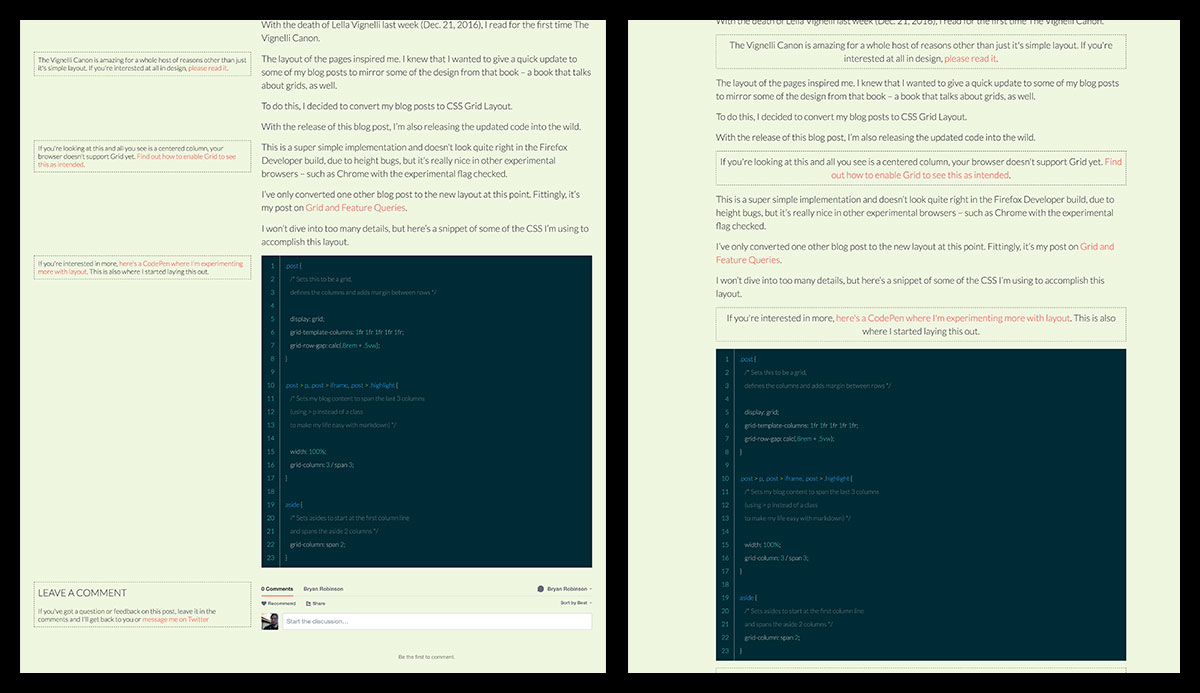
For those that don’t want to deal with adjusting the flags in their browsers to see both versions, here are two side-by-side examples of the differences in the blog posts.

Edge supports Feature Queries, unlike its predecessor. So, it was able to see my Grid declarations. To fix this for my Edge viewers — since Edge has a VERY broken implementation of Grid — I implemented a second level of Feature Query to account for browsers that support Grid (which Edge TECHNICALLY does) but also don’t support -ms-grid (which Edge does, as well) to keep Edge from seeing display: grid.
The Feature Query now looks like this (could be more elegant, but my libsass doesn’t like compound Feature Queries right now):
@supports (grid-auto-rows: 1px) {
    display: grid;
    grid-template-columns: 1fr 1fr 1fr 1fr 1fr;
    grid-row-gap: calc(.8rem + .5vw);
    > p, iframe, .highlight {
        grid-column: 3 / span 3;
        width: auto;
    }
}
I originally ended the post by sarcastically saying “Thanks Microsoft.” As it turns out, this isn’t the worst thing in the world with the May 24th @supports update. So, “Thanks Microsoft for having someone looking out for us.”