CSS Shapes — Let the Text Flow Around You
There’s magic in the air around CSS right now. There’s so much new to be excited about. One simple thing that you should get excited about is the CSS Shapes Module.
These are not CSS shapes like building triangles out of border property hacks. This is taking your content and shaping it around shapes and images.
We all know how the internet works. It’s a bunch of rectangles. Some rectangles are filled with text. Some have images. Some rectangles have rounded corners. These all are still rectangles. This dates back to table-based layout. A table is literally a grouping of rectangles. It’s all we’ve known.
What if I told you, that’s not the way it has to be?
The CSS Shapes Module allows for us to wrap text around a shape (and with Level 2, flow text INTO a shape, but that’s still a ways away from production).
It’s actually relatively simple to implement and works in VERY modern browsers with a simple fall back just to the way the internet has always worked.
Let’s take a look at a few examples.
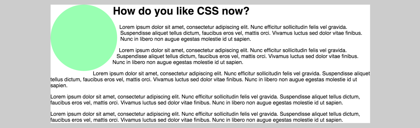
So, if we have a circle (a shape I’m building via CSS in the other definition of CSS Shapes) and we float it left to allow the text to wrap around it, we get what we expect. A circle with text around it with two hard lines of whitespace.
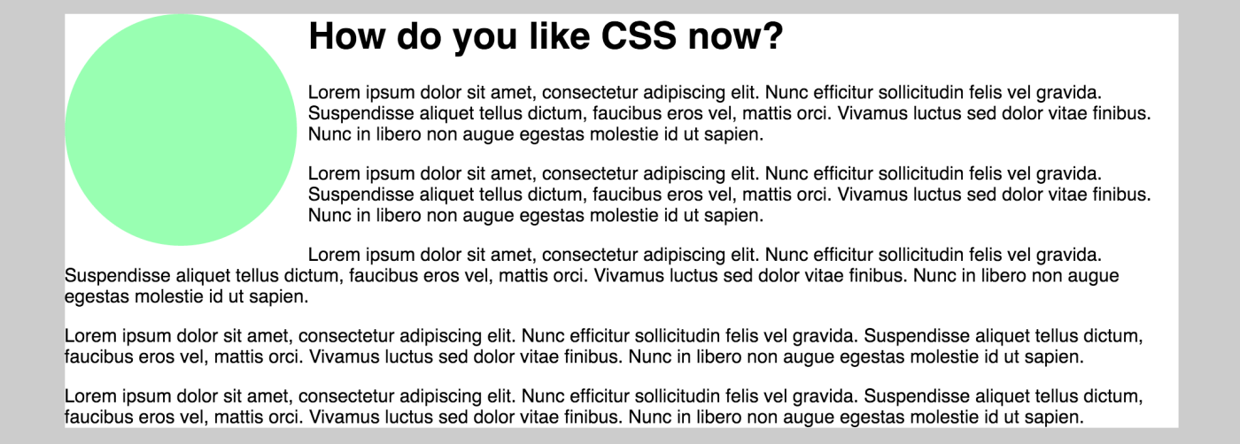
That creates a little visual dissonance, though. If we’re trying to add fluidity to our design, the hard lines of that text ruin the feeling.
We can simply add a property of css called “shape-outside” and assign a value of “circle()” and now the text KNOWS that that element is a circle and wraps around it in a nice fluid curve.
Circle is by far the easiest “cool” shape-outside, but you can also do ellipse() and polygon(), url() for images.
Here’s a CodePen that shows an example of polygon() and url() as well as the circle example from above.
See the Pen CSS Shapes Module by Bryan Robinson (@brob) on CodePen.light